• Our booking engine at tickets.railforums.co.uk (powered by TrainSplit) helps support the running of the forum with every ticket purchase! Find out more and ask any questions/give us feedback in this thread!

New Logo for Northern Trains LTD

Status
Not open for further replies.
Sponsor Post - registered members do not see these adverts; click here to register, or click here to log in
R

RailUK Forums

Mollman

Established Member
Joined
21 Sep 2016
Messages
1,225
That was suppose to be the case already!

At least in this case it's just the logos they need to change, rather than the whole colour scheme.

Except the livery could do with a bit of treatment, the current one looks a bit half hearted, especially on non-driving coaches.
 

Bletchleyite

Veteran Member
Joined
20 Oct 2014
Messages
97,783
Location
"Marston Vale mafia"
Except the livery could do with a bit of treatment, the current one looks a bit half hearted, especially on non-driving coaches.

I disliked it to start with but found it was very much a grower, I actually like it now, particularly on the CAF units (was it specifically designed for those then adapted for other units perhaps?)

A CAF unit in the new livery with the "audio branding" (the friendly sounding Northern autoannouncer on board) is all in all quite an attractive, local-feeling branding package.
 

py_megapixel

Established Member
Joined
5 Nov 2018
Messages
6,672
Location
Northern England
I disliked it to start with but found it was very much a grower, I actually like it now, particularly on the CAF units (was it specifically designed for those then adapted for other units perhaps?)

A CAF unit in the new livery with the "audio branding" (the friendly sounding Northern autoannouncer on board) is all in all quite an attractive, local-feeling branding package.

I feel the same; the livery has grown on me.

The main thing I don't like about is that it's inconsistent, for example on 156s, 158s, 170s and 333s the first doors on the driving vehicles are white, while on 150s, 319s, 323s and Civities they are blue. I understand that on a 156 you couldn't fit the "swoosh" before the door, and on a 158 you probably could but it would look silly, but what about the 170s and 333s? Also there's a few units around where the shade of blue doesn't quite match - why?

I'd actually prefer it if the livery was reversed: blue with white swoosh and doors.
 

Stigy

Established Member
Joined
6 Nov 2009
Messages
4,882
I always found the current/previous branding a bit of a fail really....the ‘n’ looks like a sad face....As branding goes, I’d say that’s a psychological no no.
 

omnicity4659

Member
Joined
25 Sep 2017
Messages
152
Also there's a few units around where the shade of blue doesn't quite match - why?

The livery was updated in late-2017/early-2018 to match the new Arriva brand. Northern updated their blue to "Arriva Dark Blue" and the smaller logos within it to "Arriva Purple", "Arriva Yellow" and "Arriva Blue". Because of that, trains which were already painted simply got the vinyls updated, hence the mismatch of blue.
 

aiden_g1

Member
Joined
17 Dec 2015
Messages
40
The livery was updated in late-2017/early-2018 to match the new Arriva brand. Northern updated their blue to "Arriva Dark Blue" and the smaller logos within it to "Arriva Purple", "Arriva Yellow" and "Arriva Blue". Because of that, trains which were already painted simply got the vinyls updated, hence the mismatch of blue.

With that in mind, i wonder if the coloured "n" logo spots on the cab ends of the trains will be dropped too. Going for an all over simple blue and white livery. It would look much smarter.
 

omnicity4659

Member
Joined
25 Sep 2017
Messages
152
I'm currently sat at a distance from the staff member, but I think I've just spotted the new logo on their blue social distancing high vis...
 

johntea

Established Member
Joined
29 Dec 2010
Messages
2,599
I forgot to take a picture but will try to remember to take one next week, the ‘new’ logo is set up on their recently installed ‘tap and go’ terminal screens on the Harrogate line, it looked horrendous!

And that was on a screen no larger than a phone screen...
 

scrapy

Established Member
Joined
15 Dec 2008
Messages
2,092
Just to add there is more to the logo change than just capitalisation with the 'n' logo going to subtly change over time particularly on media screens and tvms.

The artwork I've seen looks good and will fade between the current dark blue and a more silvery colour.

This may find its way onto printed media and posters over time as these are changed but is unlikely to incur extra cost and won't be used on signage or train livery. This was probably part of the £26,000 paid out.
 

johntea

Established Member
Joined
29 Dec 2010
Messages
2,599

skyhigh has kindly provided a photo of one of the validators with the logo, for some reason to me 'NORTHERN' in uppercase feels less 'friendly' than 'northern' in lowercase!
 

Bletchleyite

Veteran Member
Joined
20 Oct 2014
Messages
97,783
Location
"Marston Vale mafia"

skyhigh has kindly provided a photo of one of the validators with the logo, for some reason to me 'NORTHERN' in uppercase feels less 'friendly' than 'northern' in lowercase!

They really need to lose the "sadface", to be honest. To be fair it partly looks rubbish because whoever implemented it has squashed it vertically.
 

py_megapixel

Established Member
Joined
5 Nov 2018
Messages
6,672
Location
Northern England

skyhigh has kindly provided a photo of one of the validators with the logo, for some reason to me 'NORTHERN' in uppercase feels less 'friendly' than 'northern' in lowercase!
You'll also notice that the logo is not scaled properly, causing it to appear stretched and distorted.

Of all the current TOC brands, this one probably reflects the relevant TOC the best - in that it's half-***ed and cheap-feeling.
 

HarryL

Member
Joined
14 Sep 2020
Messages
241
Location
Leeds
Just joined the forum but have been a lurker for a while, decided to throw another concept into the mix here as the new logo is awful. Mines a mix between the old Northern Spirit/Rail design and the Arriva version.

Concept alternative logo for the Northern franchise.
 

scrapy

Established Member
Joined
15 Dec 2008
Messages
2,092
There does seem to be a feeling in Northern that the logo has to be some form of N, whereas it generally doesn't seem to be the case at the majority of other TOCs that the logo has to be based on the initial letter.
 

Domh245

Established Member
Joined
6 Apr 2013
Messages
8,426
Location
nowhere
There does seem to be a feeling in Northern that the logo has to be some form of N, whereas it generally doesn't seem to be the case at the majority of other TOCs that the logo has to be based on the initial letter.

Going through the list of TOCs:

Abellio Scotrail: Stylised Saltaire
Avanti: Stylised letter A
c2c: none/name
Caledonian Sleeper: Stylised stag
Chiltern: none/name
Cross Country: Stylised X (from abbreviation XC)
EMR: Abbreviation
GTR
{Great Northern: flying triangle
{Thameslink: none/name
{Southern: roundel
{Gatwick Express: Abbreviation
Grand Central: Winged circle with abbreviation
Greater Anglia: none (hare for local lines)
GWR: Abbreviation
Heathrow Express: Stylised X
Hull Trains: Heart
LNER: Abbreviation (/Stylised N)
London Overground: Roundel
Merseyrail: M in a circle
Northern: n in a circle
SouthEastern: Abbreviation
SWR: stylised network map
TfL Rail/Elizabeth Line: Roundel
TPE: 'pole star'
TfW: Stylised T
West Midlands Trains:
{LNWR: Stylised W
{WMR: Diamonds (Transport for West Midlands standard pattern)

In most cases () the 'logo' is either non-existent, or an abbreviation of a name too long to be condensed nicely. In northern's case, the abbreviation does just become N of course

A lot of the name disconnected designs (where they haven't just stylised the name/a letter in it) have got existing heritage or an obvious source: Scotrail, Southern, LO, TfL Rail, & WMR. It's only Caledonian Sleeper, Hull Trains, SWR, TPE (and possibly GN's triangle) that are real 'independent' logos. Notably most of them are also intercity operators where the branding is all the more important - quite what name-disconnected logo you choose to do for a mediocre commuter operation I don't know!
 

syorksdeano

Member
Joined
7 Jan 2011
Messages
729
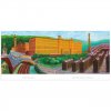
Northern wanted to use a picture of a customer using a pacer, but the nearest they could find was this famous paintingIMG_20200914_191826.jpg
 

JaJaWa

Established Member
Joined
14 Feb 2013
Messages
1,705
Location
It's meant to be a compass, I think, associating it with long haul travel.
It’s the X from Heathrow eXpress stylised to look like a car badge (it’s basically identical to Mercedes Benz’s bevelled version).
 

Rhydgaled

Established Member
Joined
25 Nov 2010
Messages
4,568
Just joined the forum but have been a lurker for a while, decided to throw another concept into the mix here as the new logo is awful. Mines a mix between the old Northern Spirit/Rail design and the Arriva version.

View attachment 83531
I quite like that, but it still has the problem that the original logo has, ie. the N is repeated in the name 'northern' to the right of the circle. I think the N in the circle might look better if it was part of the name.
 

tpjm

Member
Joined
25 Jan 2019
Messages
484
Location
The North
For me, I’d say stop calling it “Northern” and stop using the N as a stylised logo-mark!
 

peters

On Moderation
Joined
28 Jul 2020
Messages
916
Location
Cheshire
For me, I’d say stop calling it “Northern” and stop using the N as a stylised logo-mark!

What about the logo saying NO TRAINS, they could roll it out at stations on the Rose Hill Marple line first.
 

js1000

Member
Joined
14 Jun 2014
Messages
1,011
Just joined the forum but have been a lurker for a while, decided to throw another concept into the mix here as the new logo is awful. Mines a mix between the old Northern Spirit/Rail design and the Arriva version.

View attachment 83531
Very dated if I'm honest.

I don't mind the Northern font, logo and colour scheme since Arriva. It's simple and clear. There's no comparison when you compare it with the old Northern with that god-awful, gaudy purple they had.
 
Status
Not open for further replies.

Top