• Our booking engine at tickets.railforums.co.uk (powered by TrainSplit) helps support the running of the forum with every ticket purchase! Find out more and ask any questions/give us feedback in this thread!

Stations rebranded to Great British Railways design / Rail Alphabet 2

Goldfish62

Established Member
Joined
14 Feb 2010
Messages
10,034
I'm all for national standardisation of signage. It should never have been allowed to get to where it is today. However, is this the best that anyone can come up with? An apologetic, anaemic version of a 1960s design. A design that for anyone middle aged plus is a reminder of a dismal period for Britain's railways.

I don't understand the sudden rush. Surely it would have been better for GBR to be set up to give it a chance to develop and adopt its own design standards.

Personally I'd have preferred adoption of Network Rail signage, which I think looks modern, clear and smart.
 
Sponsor Post - registered members do not see these adverts; click here to register, or click here to log in
R

RailUK Forums

physics34

Established Member
Joined
1 Dec 2013
Messages
3,697
I'm all for national standardisation of signage. It should never have been allowed to get to where it is today. However, is this the best that anyone can come up with? An apologetic, anaemic version of a 1960s design. A design that for anyone middle aged plus is a reminder of a dismal period for Britain's railways.

I don't understand the sudden rush. Surely it would have been better for GBR to be set up to give it a chance to develop and adopt its own design standards.

Personally I'd have preferred adoption of Network Rail signage, which I think looks modern, clear and smart.
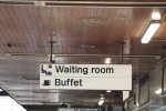
BR certainly had its good times too.

I agree it should be bolder....which means 'Rail Alphabet' as we remember it. Apart from that, its clear and does the job.
 

ABB125

Established Member
Joined
23 Jul 2016
Messages
3,761
Location
University of Birmingham
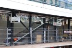
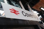
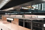
I happened to be at Coventry for about 5 minutes just now. Here are some pictures of the signage.

This is what the old signage looks like:
20211016114140_IMG_4563.JPG20211016114154_IMG_4564.JPG

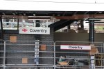
Here are some general shots of the new signage. You can also make a comparison with the temporary signage installed for the building work:
20211016114218_IMG_4566.JPG20211016114205_IMG_4565.JPG20211016114237_IMG_4567.JPG

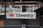
Some close-ups:
20211016114241_IMG_4568.JPG20211016114526_IMG_4573.JPG

Personally I'm not convinced that the station name boards need three support columns, each with three fixings, but maybe the signs are really heavy? In which case, why not make them lighter? At first glance this seems like an area where money could have been saved:
20211016114512_IMG_4572.JPG

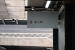
Similarly, this sign seems to have a lot of wasted space (though there may be more on the other side which can't be seen):
20211016114300_IMG_4569.JPG

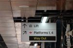
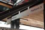
Finally, this is the sign at the bottom of the stairs. Personally, I think it would benefit from some arrows:
20211016114414_IMG_4571.JPG
 

HarryL

Member
Joined
14 Sep 2020
Messages
241
Location
Leeds
Very nice. Who would have thought Avanti would be the first to get the new signage spot on, Northerns attempt has been shown up here.

I'm all for national standardisation of signage. It should never have been allowed to get to where it is today. However, is this the best that anyone can come up with? An apologetic, anaemic version of a 1960s design. A design that for anyone middle aged plus is a reminder of a dismal period for Britain's railways.

I don't understand the sudden rush. Surely it would have been better for GBR to be set up to give it a chance to develop and adopt its own design standards.

Personally I'd have preferred adoption of Network Rail signage, which I think looks modern, clear and smart.
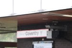
This signage technically isn't for GBR, it was started by Network Rail back around 2018, long before GBR was conceived. The signage and everything would have still happened even if GBR hadn't, Network Rail was intended to fade into a background brand with more focus on the double arrow and no TOC branded signs. It just so happens that covid happened and collapsed the franchising model in a way that coincided with this.
 
Last edited:

Goldfish62

Established Member
Joined
14 Feb 2010
Messages
10,034
This signage technically isn't for GBR, it was started by Network Rail back around 2018, long before GBR was conceived. The signage and everything would have still happened even if GBR hadn't, Network Rail was intended to fade into a background brand with more focus on the double arrow and no TOC branded signs. It just so happens that covid happened and collapsed the franchising model in a way that coincided with this.
Yet the signage at Clapham Junction, previously to SWT style was updated only last year to Network Rail style.
 

HarryL

Member
Joined
14 Sep 2020
Messages
241
Location
Leeds
Yet the signage at Clapham Junction, previously to SWT style was updated only last year to Network Rail style.
It only started being developed around 2018, took until late last year to be at a stage where they were ready to do the first public showcases at the Design Museum and until earlier this year to allow it to start to be rolled out to stations. Network Rail are doing a rolling process of replacing the old signage in their stations too, bits and pieces are making their way into Euston and Paddington will be resigned completely when Crossrails ready to go.
 

swt_passenger

Veteran Member
Joined
7 Apr 2010
Messages
31,409
I’m still not convinced you need the red “arrows of indecision” once you‘re actually on a platform, (or viewing from a train window), unless there’s a requirement to differentiate between adjacent service groups on nearby platforms, say mainline train and tram, or mainline train and underground. AFAICS theres no scope for confusion within Coventry station.
 

Goldfish62

Established Member
Joined
14 Feb 2010
Messages
10,034
It only started being developed around 2018, took until late last year to be at a stage where they were ready to do the first public showcases at the Design Museum and until earlier this year to allow it to start to be rolled out to stations. Network Rail are doing a rolling process of replacing the old signage in their stations too, bits and pieces are making their way into Euston and Paddington will be resigned completely when Crossrails ready to go.
Ah right, got it. Thanks.

I’m still not convinced you need the red “arrows of indecision” once you‘re actually on a platform, (or viewing from a train window), unless there’s a requirement to differentiate between adjacent service groups on nearby platforms, say mainline train and tram, or mainline train and underground. AFAICS theres no scope for confusion within Coventry station.
Although it does add a touch of colour to what is otherwise very bland signage.
 

bnc2018

Member
Joined
14 May 2021
Messages
21
Location
Banbury, Oxfordshire
I happened to be at Coventry for about 5 minutes just now. Here are some pictures of the signage.

This is what the old signage looks like:
View attachment 104131View attachment 104132

Here are some general shots of the new signage. You can also make a comparison with the temporary signage installed for the building work:
View attachment 104133View attachment 104134View attachment 104135

Some close-ups:
View attachment 104136View attachment 104140

Personally I'm not convinced that the station name boards need three support columns, each with three fixings, but maybe the signs are really heavy? In which case, why not make them lighter? At first glance this seems like an area where money could have been saved:
View attachment 104139

Similarly, this sign seems to have a lot of wasted space (though there may be more on the other side which can't be seen):
View attachment 104137

Finally, this is the sign at the bottom of the stairs. Personally, I think it would benefit from some arrows:
View attachment 104138
Is this the closest example we've seen of signage that actually conforms to the NR wayfinding document? Namely the double arrow in front of the station.

Having said that, looking at the spec in #466, it seems the arrows look a little too small - the Platforms 1,4 and way out arrow seems like it should be a bit bigger. Also it may be just me but I think Platforms 1 and 4 seems more natural than Platforms 1, 4.
 

Gareth

Established Member
Joined
10 Mar 2011
Messages
1,449
Location
Liverpool
It's part of the brand. I'm glad it's there.

The sign could do with a outline of some kind though. White signs without outlines look kinda weird to me.
 

thomalex

Member
Joined
25 Aug 2021
Messages
342
Location
Leeds
Very nice and confirms that design guidelines released earlier in the year are the ones being implemented. Northern's attempt is some sort of temporary half way house.
 

the sniper

Established Member
Joined
4 Sep 2007
Messages
3,499
White signs without outlines look kinda weird to me.

It's certainly not a style most other railways around the world have gone for in recent decades. I suppose you could at least argue it's now a fairly unique design on that basis...
 

Sm5

Member
Joined
21 Oct 2016
Messages
1,013
Whats happening with the old signage ?

any chance for collectors to buy ?

AFAIK Guildford has a stylised G, but I can’t find an image at the moment.

I’m curious as to how the ‘London fare zone’ signs would be rebranded…

(Image of a station board(?) at Tolworth)
Might find out in a day or two, a station local to me had all its “Southern” signs removed, so I assume the new signs are coming.
 
Last edited:

physics34

Established Member
Joined
1 Dec 2013
Messages
3,697
Whats happening with the old signage ?

any chance for collectors to buy ?


Might find out in a day or two, a station local to me had all its “Southern” signs removed, so I assume the new signs are coming.
You cant just leave it there without telling us which station?! Lol
 

Noddy

Member
Joined
11 Oct 2014
Messages
1,009
Location
UK
Some close-ups:
View attachment 104136View attachment 104140

Personally I'm not convinced that the station name boards need three support columns, each with three fixings, but maybe the signs are really heavy? In which case, why not make them lighter? At first glance this seems like an area where money could have been saved

Presumably it’s not weight that’s the issue but the nature of what they could attach it to in ?roof, along with the potential exposure to strong winds causing twisting.
 

Goldfish62

Established Member
Joined
14 Feb 2010
Messages
10,034
Whats happening with the old signage ?

any chance for collectors to buy ?


Might find out in a day or two, a station local to me had all its “Southern” signs removed, so I assume the new signs are coming.
Did the signs need replacing?
 

nlogax

Established Member
Joined
29 May 2011
Messages
5,371
Location
Mostly Glasgow-ish. Mostly.
Still unsure about the Coventry installation. The double arrows on the platform boards as per the guidelines are a welcome splash of colour but those flimsy new signs and the lighter weight typeface already look a bit lost against the busy station infrastructure behind them.
 
Joined
9 Dec 2012
Messages
600
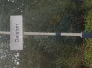
Just travelling up the Cumbrian Coast from Millom to Carlisle. Nothing has been GBR'd (northern way) south of Sellafield to Lancaster but I've noticed, Nethertwown, Harrington, Flimby Maryport, Aspatria, Wigton and Dalston.

20211017_122218.jpg


Since my last visit in June temporary style platform number signs have also been randomly tacked up on platform fences and walls along the route. I always thought it odd that most of the stations didn't ever have them!
 

CJ

Member
Joined
18 May 2009
Messages
201
Location
Stockport
Not sure if it's already been mentioned but can report the following Northern stations now have RA2/GBR'd:

- Sandbach
- Holmes Chapel
- Goostrey
- Alderley Edge
- Handforth
 

Hb06_

Member
Joined
27 Mar 2020
Messages
174
Location
Northampton
Coventry (Avanti West Coast) has new signs, complete with the intended double arrows (possibly confirming that the logo won’t be modified by GBR).

Source: https://twitter.com/pettittemily/status/1449314204893208577?s=21View attachment 104126
I've seen these too. I have some contacts at Avanti West Coast - I'll see what they have to say.

The last time I was at Coventry with AWC, they told me they had to take their old branded signs down and put new ones in, in the old British Rail branding (red lines on top and bottom) because Coventry is a listed station, but they didn't realise until they rebranded the signage.
 

haggishunter

Member
Joined
25 Aug 2016
Messages
349
Anyone else think the three poles on that Coventry sign should have been black ? Looks like matching poles to sign’s background colour negates making the sign stand out from general station background - certainly in that case where there’s quite a bit of black behind already.
 

tpjm

Member
Joined
25 Jan 2019
Messages
484
Location
The North
Finally, this is the sign at the bottom of the stairs. Personally, I think it would benefit from some arrows:
View attachment 104138

This implementation is correct according to the guidelines document.


Having said that, looking at the spec in #466, it seems the arrows look a little too small - the Platforms 1,4 and way out arrow seems like it should be a bit bigger. Also it may be just me but I think Platforms 1 and 4 seems more natural than Platforms 1, 4.

They look alright to me.

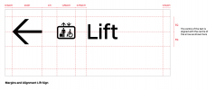
From the guidelines document:
 

Attachments

  • NRGuidanceArrowsScreenshot.png
    NRGuidanceArrowsScreenshot.png
    135.1 KB · Views: 55

Hb06_

Member
Joined
27 Mar 2020
Messages
174
Location
Northampton
Hi all,

I've created a website that allows you to report when a station has received new signage. It's very simple and easy to use. I'm going to add some that I've seen, but if someone would like to go and find proof of stations that have got new signage, that would be great.

Some people have mentioned stations on this thread that have been given the GBR treatment, but there's no image of that annoyingly.

GBR Signage Tracker (glide.page)

Harry.
 
Last edited:

OverSpeed

Member
Joined
13 Nov 2017
Messages
51
Location
Rugby
There is something about the new signage that I find odd, but I can not think why that is so!

Just out of interest, when GBR is in full control, will the split regions have different signage, or will it be the same right across the land?
 

Goldfish62

Established Member
Joined
14 Feb 2010
Messages
10,034
Just out of interest, when GBR is in full control, will the split regions have different signage, or will it be the same right across the land?
Who can say? GBR is three years away yet and the current "new" signage being installed is being widely referred to on here as GBR even though it has been developed by Network Rail.
 

Top