• Our booking engine at tickets.railforums.co.uk (powered by TrainSplit) helps support the running of the forum with every ticket purchase! Find out more and ask any questions/give us feedback in this thread!

Stations rebranded to Great British Railways design / Rail Alphabet 2

Grumpy Git

On Moderation
Joined
13 Oct 2019
Messages
2,140
Location
Liverpool
I very much doubt a narrow strip of colour at the top and bottom of a sign will make a blind bit of difference to accessibility other than making it look better to everyone.
But it makes it more expensive and is totally unnecessary, only two colours are needed, the text and the background.
 
Sponsor Post - registered members do not see these adverts; click here to register, or click here to log in
R

RailUK Forums

Bletchleyite

Veteran Member
Joined
20 Oct 2014
Messages
98,392
Location
"Marston Vale mafia"
But it makes it more expensive and is totally unnecessary, only two colours are needed, the text and the background.

Branding sells a product and makes it look attractive. If you want to return to the drabness and run-down appearance of 1980s BR be my guest, but 1980s BR was rubbish in the vast majority of ways.
 

HYPODERMIC

Member
Joined
14 Feb 2011
Messages
87
Location
Chingford
But it makes it more expensive and is totally unnecessary, only two colours are needed, the text and the background.

You could say the same about the trains. Why not have them all in plain white? After all, making trains look nice is unnecessary and costs money too...

Sometimes I think there's a lingering view (among a small minority) in the industry that the railway should really be engineering-led again, that we should do away with bad old management, and all those cushy office jobs wasting time on unimportant things like marketing.

But we have a business-led railway; we need to attract passengers onto trains if we want the industry to have a future; and so marketing and branding should be taken seriously.

You can, of course, take this argument too far. The constant churn of franchise rebranding has certainly been wasteful, and probably counterproductive. Perhaps management and marketing functions across the industry may have grown too large for the scale of the task that actually needs doing - that seems to be what NR, DfT and HMT have concluded, going by the latest restructuring. And nor am I suggesting that painting a coloured stripe on running-in boards on its own will get people out of their cars.

But the answer surely can't be to go all the way to the opposite end of the spectrum, doing away with any notion of branding, marketing and indeed any sense of customer appeal whatsoever.

Attractive branding and marketing makes the railway more appealing and pleasing to the traveller. If you're competing against the car and the coach, you need to work hard as an industry to appeal to potential customers. Austere, cheap, bland presentation does you no favours. I am convinced - albeit I cannot prove to you - that Virgin Trains and GNER were more successful than they would have been, had been named and branded much like the current Thameslink franchise is.

Branding cannot - and should not - substitute for operational competence and affordable fares. But I really don't think GBR should adopt austere and sterile branding in a misguided attempt to seem efficient and uncomplicated. There's a balance to be struck between simplicity and aesthetics. More than at any point in the last thirty years, the railway needs to be doing everything it can to win passengers back, and developing an attractive, inviting, coherent and widely-understood brand will have some at least some contribution to make in doing that. The design of station signage is a small part of this; I don't want to overstate its importance. But nor should the railway tell itself that a bit of colour is a luxury too far.
 
Last edited:

Grumpy Git

On Moderation
Joined
13 Oct 2019
Messages
2,140
Location
Liverpool
I'm on about the station name boards not the trains.

Add a stripe and the size of the board becomes relevant, etc, etc. Just complicated (expensive) for the sake if it. The country is on its arris, there really is no need to spend cash on pointless crap like this.
 

Bletchleyite

Veteran Member
Joined
20 Oct 2014
Messages
98,392
Location
"Marston Vale mafia"
I'm on about the station name boards not the trains.

Add a stripe and the size of the board becomes relevant, etc, etc. Just complicated (expensive) for the sake if it. The country is on its arris, there really is no need to spend cash on pointless crap like this.

The quality feel of the environment at stations is a key part of the marketing package. Ask Ray Stenning about that - that's why all the bus companies advised by him who are allowed to do so put up their own quality, well-designed flags and timetable displays instead of the basic black and white local authority ones.
 

the sniper

Established Member
Joined
4 Sep 2007
Messages
3,499
But I really don't think GBR should adopt austere and sterile branding in a misguided attempt to seem efficient and uncomplicated.

Indeed. GBR needn't project cheapness and austerity with something that won't cost any more than producing the signage regardless.
 

Bletchleyite

Veteran Member
Joined
20 Oct 2014
Messages
98,392
Location
"Marston Vale mafia"
Indeed. GBR needn't project cheapness and austerity with something that won't cost any more than producing the signage regardless.

I believe these signs are being done by vinylling white and sticking the letters on. The extra cost is therefore of sticking two coloured stripes on as well. I doubt that is even remotely significant.
 

the sniper

Established Member
Joined
4 Sep 2007
Messages
3,499
I believe these signs are being done by vinylling white and sticking the letters on. The extra cost is therefore of sticking two coloured stripes on as well. I doubt that is even remotely significant.

Regardless, I'd hope that they're not the finished permanent product, I'm more concerned whether they're the final design... The vinyls will probably be worse for wear before GBR even begins.
 

Bletchleyite

Veteran Member
Joined
20 Oct 2014
Messages
98,392
Location
"Marston Vale mafia"
Regardless, I'd hope that they're not the finished permanent product, I'm more concerned whether they're the final design... The vinyls will probably be worse for wear before GBR even begins.

Even if they were for now you could still go round sticking coloured stripes on. That's been done many times over, and if the design is simple it won't be obvious that they are additions.
 

thomalex

Member
Joined
25 Aug 2021
Messages
345
Location
Leeds
Regardless, I'd hope that they're not the finished permanent product, I'm more concerned whether they're the final design... The vinyls will probably be worse for wear before GBR even begins.

As I understand it these are interim and will be rolled out to all stations in the run up to GBRs launch after which more permanent signage will then follow. GBR is supposed to have a soft launch this October building to the full launch in 2023 and the vinyl signs are a quick fix to remove current operator branding and help the network to have some consistency come launch.

The full replacement signs I expect will include the Double Arrow along with the station name on a white background as stated in the new design guidelines and will be standard sizes requiring new poles etc. The roll out of this will be much slower so clearly we'll be seeing the vinyls for some time.
 
Last edited:

jon0844

Veteran Member
Joined
1 Feb 2009
Messages
28,123
Location
UK
BR wasn't far off with these. Blue for regional, red for InterCity. Both colours of the Union Flag. Top and bottom looks good and is different from what is there now (other than the Northern City Line I suppose).

Plain white just looks naff.

There's white on the union flag too..!

I think there needs to be a border of some sort. Not sure what colour, but something to keep your eyes 'on the page' so to speak.

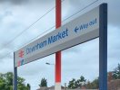
Edit: why can't we get the station name signs made with the BR logo? See example here (and I'm not suggesting the NSE bit below).

[image shows a sign with BR logo on the left of the text for the station, in this case Downham Market]
 

Attachments

  • Screenshot_2021-08-26-16-00-17-326_com.google.android.apps.photos.jpg
    Screenshot_2021-08-26-16-00-17-326_com.google.android.apps.photos.jpg
    209.5 KB · Views: 136
Last edited:

Domh245

Established Member
Joined
6 Apr 2013
Messages
8,425
Location
nowhere
I think there needs to be a border of some sort. Not sure what colour, but something to keep your eyes 'on the page' so to speak.

You could just run with something like this for the double arrow fans

1629992075220.png
 

thomalex

Member
Joined
25 Aug 2021
Messages
345
Location
Leeds
There's white on the union flag too..!

I think there needs to be a border of some sort. Not sure what colour, but something to keep your eyes 'on the page' so to speak.

Edit: why can't we get the station name signs made with the BR logo? See example here (and I'm not suggesting the NSE bit below).

[image shows a sign with BR logo on the left of the text for the station, in this case Downham Market]

That's basically what the new design guidelines show them as, just black text with a red logo. The full manual is here https://www.networkrail.co.uk/wp-co...NR_GN_CIV_300_01_Wayfinding-Design-Module.pdf

Notice how the weight of the font matches the line width of the logo, nice touch.


Screenshot 2021-08-26 at 17.18.48.png
 
Last edited:

py_megapixel

Established Member
Joined
5 Nov 2018
Messages
6,683
Location
Northern England
Worth noting that the signs which are currently being vinyled over are smaller than shown in the design guidelines. The text will probably be more readable when the signs are physically larger.
 

XAM2175

Established Member
Joined
8 Jun 2016
Messages
3,468
Location
Glasgow
Worth noting that the signs which are currently being vinyled over are smaller than shown in the design guidelines. The text will probably be more readable when the signs are physically larger.
Yes and no. The main problem is that they haven't used the heavyweight version of the typeface - but if they're varying the size of the text to fit it onto a single size of sign then yes they will run into problems.
 

Horizon22

Established Member
Associate Staff
Jobs & Careers
Joined
8 Sep 2019
Messages
7,702
Location
London
Indeed. GBR needn't project cheapness and austerity with something that won't cost any more than producing the signage regardless.

And there are indeed multiple companies who have very clean brands that are very dynamic companies.

There’s a few posters here who don’t seem to understand marketing and branding is a full on respected academic discipline with professional bodies and qualifications. Branding can be complex in the modern-day especially for something as fundamental as trains & railway.

This is mostly about signage; the full branding guidelines are yet to be known (if they have even been fully confirmed).
 
Joined
9 Dec 2012
Messages
609
You could just run with something like this for the double arrow fans

View attachment 101775
Now that looks just the job, simple and effective

That's basically what the new design guidelines show them as, just black text with a red logo. The full manual is here https://www.networkrail.co.uk/wp-co...NR_GN_CIV_300_01_Wayfinding-Design-Module.pdf

Notice how the weight of the font matches the line width of the logo, nice touch.


View attachment 101780
I wonder why the arrow has been omitted from these lash ups would make a decent difference.
 

XAM2175

Established Member
Joined
8 Jun 2016
Messages
3,468
Location
Glasgow
Branding can be complex in the modern-day especially for something as fundamental as trains & railway.
I know we've seen quite a fair bit of BR's 1963 brand manual around here but it could perhaps be illuminating to look at the "Identity Management" package put together for Regional Railways in 1992:


Quoting from the preface by Gordon Pettitt:
On 3 December 1990 one of the most fundamental reorganisations within British Rail in recent years got under way. Provincial became Regional Railways. And Regional Railways means all Britain’s passenger services except Intercity and Network SouthEast.

The name is significant. It represents a ‘family’ of railways that are to be operated on a decentralised basis. Each member of the family will aim to provide a service of quality, tuned to meet the specific needs of a readily recognisable area of the country.

All these services will interconnect seamlessly right across England, Wales and Scotland. By April 1992 we shall have reorganised ourselves into five profit centres: ScotRail, North East, North West, Central, and South Wales & West.

The ‘seamlessness’ of the operation will be represented by a new, strong but sympathetic corporate identity scheme. It will provide the ‘family likeness’. At the same time, it is flexible enough to enable staff and public alike to detect a degree of individuality, as in all families. This is particularly true in the case of the Passenger Transport Executives (PTEs) which make such a contribution to the network and plan even greater investment in the near future.

The corporate identity is a theme with variations, but the variations are pre-ordained so as to create a coherent whole.

A large number of people within the organisation have contributed their ideas. The actual scheme, the core of which is contained within the Identity Management binder, is the work of professionals with great experience in this particular field. But they have been building, and continue to build, on a foundation of your ideas. It is very much your corporate identity.

We need to put it in place quickly in order to reap the rewards of nationwide recognition. New stations and trains, and all publications due for reprinting will take on the family characteristics straight away. Existing stations and rolling stock will acquire them as and when they need refurbishing. This will help to control costs and provide us with time to raise the level of our performance. Ideally, our path towards a higher quality service and the public’s path towards greater recognition of us and what we have to offer will coincide within the next two or three years. And that will benefit us all.

Now that's obviously from some time ago now, but the principle remains sound.

I wonder why the arrow has been omitted from these lash ups would make a decent difference.
I suspect it's because single-colour vinyls are cheaper.
 

StephenHunter

Established Member
Joined
22 Jul 2017
Messages
2,169
Location
London
This reminds me - on the fast up platform at Romford, there's a new blue sign with a white sticker over it. Any idea what that is about?
 

itsrobfrancis

New Member
Joined
29 Aug 2021
Messages
1
Location
Stoke-on-Trent
Long time lurker and first time poster here.

I’m sorry, but the new GBR-style signs look terrible. The thin vinyl finish on Northern’s signs obviously doesn’t look good and you can see the old design underneath, but the design in general just doesn’t look nice, and from reading through the thread, everyone here has hit the nail on the head: the font is too thin, it lacks visual contrast, and aesthetically, it looks austere. Functional. Bland. Part of me thinks this is an intentional hark back to 1980s British Rail to invoke nostalgia about “the good old days”, but in no way was it some golden age of rail travel, in fact privatisation brought about numerous improvements over the past 25 years and has largely made rail travel an attractive alternative to the car, obviously with a few exceptions like Stagecoach’s East Midlands Trains and Serco/Abellio’s Northern Rail.

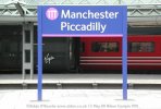
If signage was to be at least standardised, then I’d have vastly preferred the original NR Brunel style to have been rolled out, there are still numerous examples in Manchester Piccadilly and they all still look great: legible, functional and stylish. And the original pictograms/icons such as the Stockport viaduct, stylised ‘B’ for Birmingham and ‘L’ for Leeds etc were nice touches too.

815A1288-79FE-4B86-B6BC-EB97E1D3CB8D.jpeg
 

Trainfan2019

Member
Joined
9 Aug 2019
Messages
452
Long time lurker and first time poster here.

I’m sorry, but the new GBR-style signs look terrible. The thin vinyl finish on Northern’s signs obviously doesn’t look good and you can see the old design underneath, but the design in general just doesn’t look nice, and from reading through the thread, everyone here has hit the nail on the head: the font is too thin, it lacks visual contrast, and aesthetically, it looks austere. Functional. Bland. Part of me thinks this is an intentional hark back to 1980s British Rail to invoke nostalgia about “the good old days”, but in no way was it some golden age of rail travel, in fact privatisation brought about numerous improvements over the past 25 years and has largely made rail travel an attractive alternative to the car, obviously with a few exceptions like Stagecoach’s East Midlands Trains and Serco/Abellio’s Northern Rail.

If signage was to be at least standardised, then I’d have vastly preferred the original NR Brunel style to have been rolled out, there are still numerous examples in Manchester Piccadilly and they all still look great: legible, functional and stylish. And the original pictograms/icons such as the Stockport viaduct, stylised ‘B’ for Birmingham and ‘L’ for Leeds etc were nice touches too.

View attachment 101915

The bold text is how I feel about the new signage. Apart from the new signs needing to be more bold, they are bland but to the point - i.e they tell you the station name which is the main purpose really.
 

YorksLad12

Established Member
Joined
5 Feb 2020
Messages
1,913
Location
Leeds
I think the main point is that the current signs aren't *the* signs - according to the corporate ID guides we've seen. Why they're being done at all I know not, unless it's to wind us all up about how crap they are!
 

Peter Sarf

Established Member
Joined
12 Oct 2010
Messages
5,821
Location
Croydon
These are signs providing information to help people identify where they are and where they want to go. They should not be works of art. Please keep it simple as legibility is the priority. We do not need any fancy logos etc etc.
 
Last edited:

nlogax

Established Member
Joined
29 May 2011
Messages
5,388
Location
Mostly Glasgow-ish. Mostly.
I think the main point is that the current signs aren't *the* signs - according to the corporate ID guides we've seen. Why they're being done at all I know not, unless it's to wind us all up about how crap they are!

It feels like a complete waste of money for these rather poor temporary signs. I'm reminded of when TfL went a bit mad with the temporary orange signs at stations transferred to Overground services. Let's see how Paddington looks with what will hopefully be properly sized permanent signage.
 

BluePenguin

On Moderation
Joined
26 Sep 2016
Messages
1,605
Location
Kent
I really do not like the white signs with black text on. They look cheap and nasty. Up to now they only seem to exist in the North.

Full colour signs with white text look much more premium and feel modern. Southeastern and South Western Railway use a lovely dark blue. Southern use dark green. C2C use dark purple

Will all of these be replaced with ugly black and white ones?

But it makes it more expensive and is totally unnecessary, only two colours are needed, the text and the background.
Re-branding at all is un-necessary though? If cost is even an issue then a lot of money could be saved by spending it on zero colours. If a sign is readable leave it be. Don’t fix something that is not broken.
 
Last edited:

Bayum

Established Member
Joined
21 Mar 2008
Messages
2,932
Location
Leeds
At Kings Cross today, they seem to be trying out the airport branding (inverse) on the downstairs toilets (it extends inside too). It's definitely something new in the last few weeks - note the contrast with the ordinary white on blue signage.

I'm not sure why, it looks a bit of a mess to be honest having two different design systems in the same station.

The relevance to this thread - why, if they are rolling out RA2 and a new design system, is Kings Cross seemingly doing something totally different?!
I guess Kings X coupled with St Pancras might have a lot of international travellers or non-native English readers.
 

cactustwirly

Established Member
Joined
10 Apr 2013
Messages
7,486
Location
UK
Have to say this looks terrible.
Hardly any effort has gone into this.
They should have stuck to the much nicer blue signs at NR managed stations.

Also I think the green signs used on Southern look really smart, they go well with the green colour scheme of the stations
 

Top