DynamicSpirit
Established Member
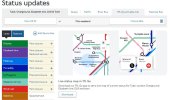
On the TfL website, up until a couple of months ago, if I checked out the live updates, then I'd see a list of the status of each tube/Overground/etc. line, alongside a very useful map of the network that highlighted any lines with issues by showing lines that are running normally in grey and lines with disruption in full colour. Now I no longer get that: I get the list of statuses, but in place of the map there's just a standard graphic and a message advising I download the TfL Go app to see the map. Like this:

(Image shows portion of TfL website with status updates and no live map)
This seems quite a backward step and is really annoying/inconvenient to me because I can very easily tell from the map whether I will have problems/need to revise my journey - a lot more quickly than I can tell by reading down the list of lines (although granted the list gives more detailed info). I don't particularly want to download another app to my phone, and besides if I'm at home I prefer to check the service status on my PC so can't use an app anyway.
Anyone know what inspired TfL to do this?
