• Our booking engine at tickets.railforums.co.uk (powered by TrainSplit) helps support the running of the forum with every ticket purchase! Find out more and ask any questions/give us feedback in this thread!

Logos on the Railways

Status
Not open for further replies.

Dai.

Established Member
Joined
2 Aug 2008
Messages
1,210
Location
Wales
Hello! I like to design in my spare time, it's a fun way of letting creativity out, but one thing I seem to struggle with, is railway logos.

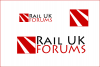
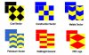
Now I notice Network Rail, have the two tracks in their logo, but what is the best logo you've seen on the railway? I wanted to just have a look through the current and past logos because RailUK has a brilliant logo but doesn't scream railways, so I tried remaking it, just for fun, it turned out terrible but I've attached it.

Is it too much like Network Rails? Or is this the road everyone takes?

Ps, sorry Mojo and other admins for taking the name for the creation, but I couldn't think of anything else.
 

Attachments

  • railuk.png
    railuk.png
    83.6 KB · Views: 48
Sponsor Post - registered members do not see these adverts; click here to register, or click here to log in
R

RailUK Forums

ainsworth74

Forum Staff
Staff Member
Global Moderator
Joined
16 Nov 2009
Messages
27,756
Location
Redcar
My personal favourite is BR's logo (in any of its various guises not just the one here):

200px-BR-logo.svg.png


I like it because it's simple and and quite clever. Also because it's just come symbolise the railways in this country, you show nearly anyone that symbol and they will know its to do with the railways. I also like it for its longevity, its lasted longer than anything else logo/livery wise of BR's in everyday use to this day (at least I think so).

Your logos are good but they are probably a bit too much like NR's really.
 

4SRKT

Established Member
Joined
9 Jan 2009
Messages
4,409
The BR logo was indeed the best. Simple, iconic, as Ainsworth says clever, and still in use after more than 45 years. I also like the NS logo, which is clearly derived from the same idea.

The old NIR logo is similarly simple and effective IMHO, but not as clever. The original unslanted version is still in use on roadsigns pointing to stations in Northern Ireland though, nearly 30 years after NIR stopped using it, and almost 10 years since they stopped using the more 'up to date' version.
 

Attachments

  • SDC11010.jpg
    SDC11010.jpg
    71.6 KB · Views: 27

pendolino

Member
Joined
22 Nov 2010
Messages
737
My personal favourite is BR's logo (in any of its various guises not just the one here):

200px-BR-logo.svg.png


I like it because it's simple and and quite clever. Also because it's just come symbolise the railways in this country, you show nearly anyone that symbol and they will know its to do with the railways. I also like it for its longevity, its lasted longer than anything else logo/livery wise of BR's in everyday use to this day (at least I think so).

Your logos are good but they are probably a bit too much like NR's really.

There was a small but great exhibition of the work of the Design Research Unit at Cubitt in Angel recently. As well as their work for Watneys, Ilford and other 70s corporations, DRU did much to develop a corporate image for BR; the exhibition included promotional material and the BR Corporate Identity Manual, fascinating and nostalgic stuff!

The exhibition's on tour, at Tate St. Ives at the moment, then Liverpool and Nottingham later in the year.

http://cubittartists.org.uk/index.p...&module=eventsmodule&src=@random475992152d537
 

sprinterguy

Established Member
Joined
4 Mar 2010
Messages
11,070
Location
Macclesfield
The BR double arrow logo is certainly the design that has demonstrated the greatest tenacity over the decades, becoming a popular icon that identifies Britains’ Railway network to this day, fifteen years after the company the logo applies to ceased to exist! It’s a very pleasing design that is universally accepted.

My favourite is the range of Roundell designed BR Trainload Freight sub-sector logos. One standard design, that used a simple range of colours and shapes to allow easy identification of each sector of Trainload freight.
 

Attachments

  • a_Railfreight_Sectors.jpg
    a_Railfreight_Sectors.jpg
    22.1 KB · Views: 28

sprinterguy

Established Member
Joined
4 Mar 2010
Messages
11,070
Location
Macclesfield
How about the late 80s/early 90s depot decals? I thought they were class!
Too right, the depot plaques were a spark of absolute genius, one of those things that really helped to demonstrate a bit of pride in the railways.
 

rail-britain

Established Member
Joined
12 Aug 2007
Messages
4,102
Just a question about Gateshead, I think it closed in the early 90's - did it ever have a plaque like those above?
No, as by that time their locos had been transferred away
In 1987 and 1988 they were reallocated to IM or CD
However, the depot remained open until sprinters took over the TransPennine service
 

gedj2

Member
Joined
3 Apr 2011
Messages
51
Location
Wigan, UK
I particularly like the BR arrows of indecision, Sub-Sector freight logos and Toton depot plaque, all fantastic examples :D
 

Hydro

Established Member
Joined
5 Mar 2007
Messages
2,204
The BR arrows are utterly timeless. I don't think they will ever die. Even Crossrail uses a variant.

Depot plaques, and the NSE route logos are fantastic also, I've never seen all the depot plaques lined up for comparison until now. What a way to inspire a real sense of pride and belonging to a job. The NSE ones instil a sense of local service, like these were "your" local trains.
 

Tom B

Established Member
Joined
27 Jul 2005
Messages
4,602
It always strikes me as amusing that in a world where all companies - railway ones included - spend a small fortune on "brand identity" and other such tat; yet if you were to ask a man on the street to draw a "railway logo" he'd probably draw the double arrows, and if asked who was responsible for the railways he'd probably say "British Rail".
 

LE Greys

Established Member
Joined
6 Mar 2010
Messages
5,389
Location
Hitchin
How about the late 80s/early 90s depot decals? I thought they were class!

Depot_Plagues.jpg

I'd love someone to explain the origins of some of these. Most seem to make sense, being references to something local, but why a seagull at Saltley? It's just about as far from the sea as you can get in Britain. The Canton Goat, Leicester Panther and Thornaby Kingfisher puzzle me as well.
 

LE Greys

Established Member
Joined
6 Mar 2010
Messages
5,389
Location
Hitchin
My personal favourite is BR's logo (in any of its various guises not just the one here):

200px-BR-logo.svg.png


I like it because it's simple and and quite clever. Also because it's just come symbolise the railways in this country, you show nearly anyone that symbol and they will know its to do with the railways. I also like it for its longevity, its lasted longer than anything else logo/livery wise of BR's in everyday use to this day (at least I think so).

Your logos are good but they are probably a bit too much like NR's really.

When first I saw this, I didn't see railway lines or arrows, I saw a combinations of the letters N (the arrows) E (the parallel lines) and X (the crossing lines. I thus called it the "NEX", hence large logo livery being "big Nex livery" and so on. Is that just me being weird, or does anyone else see the same thing?
 

Rhydgaled

Established Member
Joined
25 Nov 2010
Messages
4,568
You've mentioned the BR arrows logo, and NSE, but BR came up with some other great logos too. INTERCITY Swallow for example, does anyone know if the font is available anywhere? The INTERCITY was retained under Great Western trains on one end of each coach for a while. Another great BR logo is the Alphaline one:
attachment.php

Ok, it took Wales&West to actually apply it to the trains, as shown above. Again, I'd like the font for that if anyone knows where I can get it. Finally Wales&West and Wales&Border's own logos (which were kept insignificant next to Alphaline) were good too.

Oh, the kingfisher logo, if you look at the logo differently it looks kind of like a shark (the fish the kingfisher has caught is the shark's tail).
 

Attachments

  • Alphaline vinyl branding.jpg
    Alphaline vinyl branding.jpg
    13.9 KB · Views: 26
  • Wales&West vinyl branding for alphaline.jpg
    Wales&West vinyl branding for alphaline.jpg
    19.1 KB · Views: 9
  • Remnant-web.jpg
    Remnant-web.jpg
    20.9 KB · Views: 11
Status
Not open for further replies.

Top