I'm more of a fan of bold '90s liveries (than the old Corporation Transport schemes of the '70s/ '80s etc).
Kelvin Scottish and Strathtay Scottish were two lovely ones growing up in the central belt at that time.
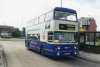
The red/ blue Go Ahead livery, the striped Leeds CityLink livery, the wonderful silver and red of Doncaster Mainline.
I also liked the 'Busways' schemes which succeeded the PTE livery, retaining the yellow but adding broad bands of colour which denoted the town that they served; red for Newcastle, green for Sunderland and blue for South Shields
I thought that was a great approach - the same design in each locality but with a different colour of stripe to make it "local". I'd have liked it if an operator like First/ Stagecoach took that approach, giving a local coloured stripe on the side of the bus (e.g. the aforementioned Glasgow "red", Manchester "orange"). So recognisable as part of the national brand, and easy enough to transfer around the country as and when required, but still "local".
The 1990s "GRT" liveries were the same kind of idea - a template pattern that was then applied around the country (dark green in Aberdeen, blue in Falkirk, maroon in Northampton...) - before the Badgerline merger (and everything becoming "Barbie").
The red, orange, yellow and cream of Leeds. The blue and red of Bradford Traveller
I thought that Leeds livery was lovely (CityLink), but the Bradford one a bit drab.
I would not dare talk about Edinburgh, since the livery keeps on changing...
What - two changes in fifty years (to "Harliquin" when low floor buses came along, then back to a more traditional "maroon" a few years later)?
many of the traditional liveries do indeed like smart on modern buses
Some do, but others really don't suit the big dark windows.
Few bus companies have designed liveries that really suit the windows on modern buses. I'd say that exceptions include Bluebird (in Manchester) and the Mainline livery for low floor buses in South Yorkshire (which was the same red/ yellow as normal buses, but with the black band of the windows swooping down at the front of the vehicle).
Then again, many modern liveries don't suit big dark windows either - I'm sure the new First livery with the lilac "
f" looked find on the designer's ipad, but doesn't translate very well onto the side of the vehicles, because the windows disrupt it.