Bletchleyite
Veteran Member
But isn't that the same place the external images have come from?
It is, yes, and I didn't post them because of copyright. What others do is to them.
I expect they'll appear online soon in any case.
But isn't that the same place the external images have come from?
Yes, in this month's Modern Railways <<snip>>
Does that also apply to the Modern Railways Android app? Because it's not there either.I believe that the May edition should appear in shops tomorrow and that subscribers have it delivered a day or two beforehand.
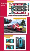
So, I’m not sure if these have been shared on here already. If not, be prepared, your in for a surprise…
So, I’m not sure if these have been shared on here already. If not, be prepared, your in for a surprise…
My only problem with the interior is simply, there’s too much grey. Even if the carpet had another colour running through it, it wouldn’t be so dark. I'm also not so sure about the “cigarette stained panel” needing to go dark either. And I type that from inside a GW HST where the walls, seats, carpet and light frames are all great but offset with tones of green in the seats and carpets.The inside colour scheme looks pretty decent to me, unfussy and minimalist - in stark contrast to the outside!
So, I’m not sure if these have been shared on here already. If not, be prepared, your in for a surprise…
I agree the interior could definitely use some more colour. In my opinion the exterior isn’t too bad apart from the bright turquoise doors as I think they clash too much with the pink.My only problem with the interior is simply, there’s too much grey. Even if the carpet had another colour running through it, it wouldn’t be so dark. I'm also not so sure about the “cigarette stained panel” needing to go dark either. And I type that from inside a GW HST where the walls, seats, carpet and light frames are all great but offset with tones of green in the seats and carpets.
That livery however, is absolute gash.
Okay this is a bit better, the whole train being pink/red felt a lot, still not sold on the turquoise doorsSo, I’m not sure if these have been shared on here already. If not, be prepared, your in for a surprise…
Okay this is a bit better, the whole train being pink/red felt a lot, still not sold on the turquoise doors
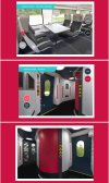
Seats look promising to me, the current standard class is awful for me, so a more modern seat gives me some hope for a slightly more comfortable future!
Honestly though, just wish the UK Government wasn't allergic to investment because XC is such an obvious choice for bi/tri mode trains
Word elsewhere on the forum is that Hitachi are only offering new sets (and not additional intermediate cars) from Italy and Japan. Both of those plants are busy so new sets would have long lead times and high prices.Honestly though, just wish the UK wasn't allergic to investment because XC is such an obvious choice for bi/tri mode trains
Looks good, bit boring but still nice. The narrower headrest makes the voyager look a little more spacious.So, I’m not sure if these have been shared on here already. If not, be prepared, your in for a surprise…
Order 11-car sets... take two out to strengthen other sets.Word elsewhere on the forum is that Hitachi are only offering new sets (and not additional intermediate cars) from Italy and Japan. Both of those plants are busy so new sets would have long lead times and high prices.
Possibly. In respect of the internal image that I said was in Modern Railways, my view was that I would not reproduce it here as a) there may be copyright issues and b) notwithstanding any legal issues, I feel that the publisher should be rewarded for views of its magazine content by purchasing or subscribing, rather than have the content (particularly images) reproduced on social media/forums etc for all to see. Maybe an old fashioned view, but there you go. (Subscriber for 41 years.)But isn't that the same place the external images have come from?
I cant see why it couldn't be done, though it doesn't get around new sets being very expensive, and having a long lead time.Order 11-car sets... take two out to strengthen other sets.
(Yes, I know that can't be done (I assume) with the 80x sets. I josh.)
Shame they didn’t do what Avanti did, and kept the original first class seats and completely re-do them, then get new seats for standard
")
It does kinda suck for those of us not in England that they've picked the names "English rose" and "Cornish clotted cream" for those shades... Where are the Scottish and Welsh names?So, I’m not sure if these have been shared on here already. If not, be prepared, your in for a surprise…
So you objected to representative names not being there, and then object when they are?It does kinda suck for those of us not in England that they've picked the names "English rose" and "Cornish clotted cream" for those shades... Where are the Scottish and Welsh names?
EDIT: So we have them but they're patronising - "Royal Mile teal" and "Cardiff Bay yellow"? (I can't quite make them out from the compression on the image and the contrast between the text and background). At least the English shades are recognisable names to an extent.
"English rose" and "Cornish clotted cream" are concepts that people have heard of, is what I mean. I have never heard of "Royal Mile teal" in my life.So you objected to representative names not being there, and then object when they are?
Sounds like you'll never be pleased. I shouldn't imagine the Cornish would find it less patronising to have their whole heritage defined by "clotted cream".
For a colour palette that none but a minority will ever hear of, that doesn't seem like an issue."English rose" and "Cornish clotted cream" are concepts that people have heard of, is what I mean. I have never heard of "Royal Mile teal" in my life.
I have to hope you are wrong, as the majority of seating in current voyager (priority seating aside) is completely unsuitable for anyone over 6ft. To reduce it further would make the train frankly un usable for anyone over 6ft. The priority seats would need rebranding "for taller customers only"!Seats are FISA LEAN as used on 196 and all UK FLIRTs. Typically hard and poor legroom as the back is very thick. And a massive downgrade for 1st.
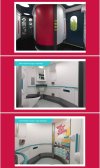
What also can’t be helpful is when there are several vertical colours along a carriage such that the doors are never the same colour. They may well contrast with the panelling alongside them, but not having them all the same colour probably goes against the guidelines somewhere.One thing that struck me is that the turquoise triangle very close to the turquoise door seems to go against accessibility guidelines that the doors should be a separate colour.
So, I’m not sure if these have been shared on here already. If not, be prepared, your in for a surprise…
Hopefully this will be tweaked before roll out to help First passengers find their carriage and to prevent Standard passengers trying to board the wrong carriage. After all let's try to make things easy for passengers....They're obviously removing the yellow stripe to signify the First Class coaches. A disappointing livery. Tweaking the existing colours would have been better.
There was nothing to stop the German government investing, but they chose not to either.Fixed that for you.