• Our booking engine at tickets.railforums.co.uk (powered by TrainSplit) helps support the running of the forum with every ticket purchase! Find out more and ask any questions/give us feedback in this thread!

Stations rebranded to Great British Railways design / Rail Alphabet 2

thomalex

Member
Joined
25 Aug 2021
Messages
343
Location
Leeds
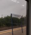
Edale-Grindleford (at least) now have GBR signage. As does Chester-le-Street.

I've only really seen it at Northern stations, is there a reason for that?

I guess we'll find out more in October which is when the "soft launch" of GBR is planned.

I would guess that Northern have started the TOC debranding a bit early given they're under state ownership and we'll begin to see it happening nationwide from October and through 2022.
 
Last edited:
Sponsor Post - registered members do not see these adverts; click here to register, or click here to log in
R

RailUK Forums

HarryL

Member
Joined
14 Sep 2020
Messages
243
Location
Leeds
The best guess for why it's only happened in Northern stations so far is because they're DfT owned, we will see if it ends up in LNER stations next. Both of those will also likely be the first two to switch to GBR first for the same reason.
 

domcoop7

Member
Joined
15 Mar 2021
Messages
250
Location
Wigan
While the emblem was on the rubbish bins and locals knew about it, the bee wasn't quite as strongly associated with the city when Picc's refurb was done in the early 2000s (in some ways it more represented Boddington's bitter). That association nationally has been very much built by campaigning after the Arena bombing a few years ago.

Does the viaduct not represent Castlefield towards Ardwick?
I don't think it's supposed to represent either. It's just a railway-ish pictogram that is in the style of the letter "M" for Manchester. See the images below.

I thought these were commissioned by Railtrack, but they must have been later as Reading and Liverpool Lime Street weren't classed as Major Stations when privatisation happened.

And incidentally, these are a classic demonstration of why silly branding of railway stations with coloured logos and the like is to be discouraged. Half of these logos don't mean anything or make any sense whatsoever. We, for example, probably know that the Euston sign represents the Doric Arch. I'd be very surprised if anybody who isn't a member of this forum knows that though!. Likewise, what's the Reading symbol supposed to be? Or Birmingham New Street? What do the different colours represent? Why does Cannon Sreet not have the letter 'C' in it, or Victoria the letter 'V' (unless you take the lapel of the dress to be a 'V')? Why is the 'L' in Leeds obscured by the Yorkshire Rose, and why are all the 'L's in the symbols for Leeds, Liverpool, Liverpool Street, and London Bridge all different sizes, etc.?
R (3).jpeg
 

61653 HTAFC

Veteran Member
Joined
18 Dec 2012
Messages
17,690
Location
Another planet...
Cannon Street does have a C on it, sort of... and the Yorkshire Rose obscures the L of Leeds because everywhere in Yorkshire that isn't Leeds is by definition better than Leeds! ;)

Can't even think of joke answers to the rest of the above queries, but I do agree than many of the logos are a bit daft, and not the "fantastic examples of corporate style" they're often lauded as.
 

Shaun_92

Member
Joined
8 Oct 2012
Messages
51
Location
Thorne, Doncaster
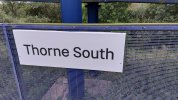
Thorne South now has the new signs as well as kirk Sandall, but Hatfield & Stainforth currently still has the old station signs. Photo's of Thorne South & Kirk Sandall signs taken today 03/09/21
 

Attachments

  • 20210903_070549.jpg
    20210903_070549.jpg
    3.4 MB · Views: 158
  • 20210903_094906.jpg
    20210903_094906.jpg
    882.2 KB · Views: 141
Last edited:

dorsetdesiro

Member
Joined
30 Oct 2017
Messages
589
I don't think it's supposed to represent either. It's just a railway-ish pictogram that is in the style of the letter "M" for Manchester. See the images below.

I thought these were commissioned by Railtrack, but they must have been later as Reading and Liverpool Lime Street weren't classed as Major Stations when privatisation happened.

And incidentally, these are a classic demonstration of why silly branding of railway stations with coloured logos and the like is to be discouraged. Half of these logos don't mean anything or make any sense whatsoever. We, for example, probably know that the Euston sign represents the Doric Arch. I'd be very surprised if anybody who isn't a member of this forum knows that though!. Likewise, what's the Reading symbol supposed to be? Or Birmingham New Street? What do the different colours represent? Why does Cannon Sreet not have the letter 'C' in it, or Victoria the letter 'V' (unless you take the lapel of the dress to be a 'V')? Why is the 'L' in Leeds obscured by the Yorkshire Rose, and why are all the 'L's in the symbols for Leeds, Liverpool, Liverpool Street, and London Bridge all different sizes, etc.?
View attachment 102103
The Reading logo seems to be a stylised part of its new footbridge with the escalator going across the logo diagonally?

Are there "Major Stations" logos created for Clapham Jct, Guildford and St Pancras?
 

Phillipimo

Member
Joined
5 Jan 2013
Messages
127
Location
Portsmouth
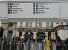
New directional signage above the gateline at Manchester Victoria.

EDIT: not new and not RA2
 

Attachments

  • IMG_20210903_103301-01-01.jpeg
    IMG_20210903_103301-01-01.jpeg
    88.3 KB · Views: 255
Last edited:

bengley

Established Member
Joined
18 May 2008
Messages
1,844
New directional signage above the gateline at Manchester Victoria.
That's been there for ages. Similar was done at Oxford Road. Neither are RA2 and they were done long before this new rollout. Expect to see RA2 covering up these signs in the future.
 

HarryL

Member
Joined
14 Sep 2020
Messages
243
Location
Leeds
I thought these were commissioned by Railtrack, but they must have been later as Reading and Liverpool Lime Street weren't classed as Major Stations when privatisation happened.
Most were Railtrack, but at various points Network Rail have had some made as stations transferred into their hands.

The Reading logo seems to be a stylised part of its new footbridge with the escalator going across the logo diagonally?

Are there "Major Stations" logos created for Clapham Jct, Guildford and St Pancras?
I'm not sure about the other two, but St Pancras has never been a Railtrack/Network Rail station, upon privatisation the station was transferred to Midland Mainline and then was handed over to HS1 Ltd prior to becoming the terminus.
 

Andyh82

Established Member
Joined
19 May 2014
Messages
3,546
I’m not sure doing it all entirely in black and white, rather than picking out the Metrolink logo in yellow for example is very good, it all looks ridiculously bland

Using the ao.com logo for the arena, who I assume are their current sponsor is a bit dodgy as well in my opinion. Will they remember to change it when the sponsor changes?
 

Meerkat

Established Member
Joined
14 Jul 2018
Messages
7,613
Has it occured to you that those "smudged/blurred" backgrounds were used to help assess the effectiveness of the new signs to the visually challenged? Wayfinding signage is probably far more import to PRM than it is to the fully able traveller.
Of course it did. But it isn’t blurred like poor vision, it’s an average colour background AIUI , which isn’t really representative of real backgrounds!
 

traji00

Member
Joined
17 Aug 2009
Messages
219
Are there "Major Stations" logos created for Clapham Jct, Guildford and St Pancras?
AFAIK Guildford has a stylised G, but I can’t find an image at the moment.

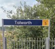
I’m curious as to how the ‘London fare zone’ signs would be rebranded…

(Image of a station board(?) at Tolworth)
 

Attachments

  • D86B5987-E71C-42F1-AB2D-7E077DD34CC7.jpeg
    D86B5987-E71C-42F1-AB2D-7E077DD34CC7.jpeg
    2.5 MB · Views: 107

Tio Terry

Member
Joined
2 May 2014
Messages
1,178
Location
Spain
Of course it did. But it isn’t blurred like poor vision, it’s an average colour background AIUI , which isn’t really representative of real backgrounds!


Isn't that the whole point for the visibly impaired? They don't see real backgrounds. I'm not just talking about people who need glasses to see some things, others have other problems, colour blindness is one, tunnel vision another, there are many more.
 

StephenHunter

Established Member
Joined
22 Jul 2017
Messages
2,155
Location
London
AFAIK Guildford has a stylised G, but I can’t find an image at the moment.

I’m curious as to how the ‘London fare zone’ signs would be rebranded…

(Image of a station board(?) at Tolworth)
Stick them in RA2 as well?
 

61653 HTAFC

Veteran Member
Joined
18 Dec 2012
Messages
17,690
Location
Another planet...
I’m not sure doing it all entirely in black and white, rather than picking out the Metrolink logo in yellow for example is very good, it all looks ridiculously bland

Using the ao.com logo for the arena, who I assume are their current sponsor is a bit dodgy as well in my opinion. Will they remember to change it when the sponsor changes?
I know "Metrolink" has been the established name for Manchester's trams for many years now, and the natives will be familiar with it... but considering the city gets a lot of overseas visitors and students, not mentioning that it means trams is a bit of an own-goal. "Metrolink Trams" would be a better label, and simply "Trams" would be even better. Or at the very least, using a tram icon rather than the vague and meaningless Metrolink logo.
 

takno

Established Member
Joined
9 Jul 2016
Messages
5,094
I know "Metrolink" has been the established name for Manchester's trams for many years now, and the natives will be familiar with it... but considering the city gets a lot of overseas visitors and students, not mentioning that it means trams is a bit of an own-goal. "Metrolink Trams" would be a better label, and simply "Trams" would be even better. Or at the very least, using a tram icon rather than the vague and meaningless Metrolink logo.
If you're going to make it clear to foreigners then using the international symbol for a team rather than the really unclear one the new style guide demands would be essential. As it is any foreigners who've planned their journey, which is all of them who know they need a tram, will know the name and the logo
 

61653 HTAFC

Veteran Member
Joined
18 Dec 2012
Messages
17,690
Location
Another planet...
If you're going to make it clear to foreigners then using the international symbol for a team rather than the really unclear one the new style guide demands would be essential. As it is any foreigners who've planned their journey, which is all of them who know they need a tram, will know the name and the logo
I suppose I should just be grateful that Manchester didn't call their trams "Super" like Sheffield. Does it fly? No? Not very Super then is it? It's just a tram. Call a spade a spade, it works for every other European city but for some reason in England we have to give it a stupid name. <(

(Sorry, rant over)
 

YorksLad12

Established Member
Joined
5 Feb 2020
Messages
1,903
Location
Leeds
I don't think it's supposed to represent either. It's just a railway-ish pictogram that is in the style of the letter "M" for Manchester. See the images below.

I thought these were commissioned by Railtrack, but they must have been later as Reading and Liverpool Lime Street weren't classed as Major Stations when privatisation happened.

And incidentally, these are a classic demonstration of why silly branding of railway stations with coloured logos and the like is to be discouraged. Half of these logos don't mean anything or make any sense whatsoever. We, for example, probably know that the Euston sign represents the Doric Arch. I'd be very surprised if anybody who isn't a member of this forum knows that though!. Likewise, what's the Reading symbol supposed to be? Or Birmingham New Street? What do the different colours represent? Why does Cannon Sreet not have the letter 'C' in it, or Victoria the letter 'V' (unless you take the lapel of the dress to be a 'V')? Why is the 'L' in Leeds obscured by the Yorkshire Rose, and why are all the 'L's in the symbols for Leeds, Liverpool, Liverpool Street, and London Bridge all different sizes, etc.?
View attachment 102103
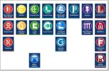
They were (first) done in 1999. See http://www.johnlloyd.uk.com/lloyd-northover/identity/51/1/
The Leeds one has the rose growing through a crack in some dodgy paving, I always thought.

I suppose I should just be grateful that Manchester didn't call their trams "Super" like Sheffield. Does it fly? No? Not very Super then is it? It's just a tram. Call a spade a spade, it works for every other European city but for some reason in England we have to give it a stupid name. <(

(Sorry, rant over)
Leeds would also have been Supertram. Because trams really are super. Like Britain is. It should really be Super Great British Railways.
( :lol: )
 

Andyh82

Established Member
Joined
19 May 2014
Messages
3,546
I know "Metrolink" has been the established name for Manchester's trams for many years now, and the natives will be familiar with it... but considering the city gets a lot of overseas visitors and students, not mentioning that it means trams is a bit of an own-goal. "Metrolink Trams" would be a better label, and simply "Trams" would be even better. Or at the very least, using a tram icon rather than the vague and meaningless Metrolink logo.
If the overseas visitor knows that Manchester has trams, because they’ve read it somewhere, they will probably know they are called Metrolink

It’s like if there was a sign pointing to the Arndale, maybe it should say ‘Indoor Shopping Centre’ in case people don’t know it’s called the Arndale.

I suppose I should just be grateful that Manchester didn't call their trams "Super" like Sheffield. Does it fly? No? Not very Super then is it? It's just a tram. Call a spade a spade, it works for every other European city but for some reason in England we have to give it a stupid name. <(

(Sorry, rant over)
I visited Dublin, I couldn’t find the “tram” anywhere. There was this thing called the Luas running about though
 

plugwash

Established Member
Joined
29 May 2015
Messages
1,570
I know "Metrolink" has been the established name for Manchester's trams for many years now, and the natives will be familiar with it... but considering the city gets a lot of overseas visitors and students, not mentioning that it means trams is a bit of an own-goal. "Metrolink Trams" would be a better label, and simply "Trams" would be even better. Or at the very least, using a tram icon rather than the vague and meaningless Metrolink logo.
I suppose I should just be grateful that Manchester didn't call their trams "Super" like Sheffield. Does it fly? No? Not very Super then is it? It's just a tram. Call a spade a spade, it works for every other European city but for some reason in England we have to give it a stupid name.
I could be wrong, but I suspect there was a deliberate decision to distance the "new generation tramways" from the "old generation tramways". When the new generation tramways were being proposed, the decline and eventual scrapping of the old generation tramways would still have been in living memory for some people.

I'm not convinced for a vistor, knowing whether a system is a fully segregated metro or a hybrid system like the metrolink is all that significant.
 

bramling

Veteran Member
Joined
5 Mar 2012
Messages
17,790
Location
Hertfordshire / Teesdale
I could be wrong, but I suspect there was a deliberate decision to distance the "new generation tramways" from the "old generation tramways". When the new generation tramways were being proposed, the decline and eventual scrapping of the old generation tramways would still have been in living memory for some people.

I'd imagine that's exactly the reason. ISTR Manchester's system was generally referred to as "LRT" around its start.

No doubt there was some level of apprehension about replacing heavy-rail routes with trams, so emphasising the positive aspects of light rail will have helped assuage this. Terms like Metrolink are now way too firmly embedded in the local way of life to be changed.
 

61653 HTAFC

Veteran Member
Joined
18 Dec 2012
Messages
17,690
Location
Another planet...
I could be wrong, but I suspect there was a deliberate decision to distance the "new generation tramways" from the "old generation tramways". When the new generation tramways were being proposed, the decline and eventual scrapping of the old generation tramways would still have been in living memory for some people.

I'm not convinced for a vistor, knowing whether a system is a fully segregated metro or a hybrid system like the metrolink is all that significant.
Only because in the UK we were short-sighted enough to get rid of trams even in our largest cities.

I'm not sure what the relevance of your second paragraph is though. I never mentioned "metros" and in any case only transport nerds like us bother to make the distinction. If it looks like a tram and works like a tram, just call it a tram.
 

plugwash

Established Member
Joined
29 May 2015
Messages
1,570
Take a look at the Tyne and wear metro or heck even then London underground. They are clearly not trams but IMO the metrolink has more in common with them than it does with historic tramways.
 

Peter Sarf

Established Member
Joined
12 Oct 2010
Messages
5,734
Location
Croydon
I don't think it's supposed to represent either. It's just a railway-ish pictogram that is in the style of the letter "M" for Manchester. See the images below.

I thought these were commissioned by Railtrack, but they must have been later as Reading and Liverpool Lime Street weren't classed as Major Stations when privatisation happened.

And incidentally, these are a classic demonstration of why silly branding of railway stations with coloured logos and the like is to be discouraged. Half of these logos don't mean anything or make any sense whatsoever. We, for example, probably know that the Euston sign represents the Doric Arch. I'd be very surprised if anybody who isn't a member of this forum knows that though!. Likewise, what's the Reading symbol supposed to be? Or Birmingham New Street? What do the different colours represent? Why does Cannon Sreet not have the letter 'C' in it, or Victoria the letter 'V' (unless you take the lapel of the dress to be a 'V')? Why is the 'L' in Leeds obscured by the Yorkshire Rose, and why are all the 'L's in the symbols for Leeds, Liverpool, Liverpool Street, and London Bridge all different sizes, etc.?
View attachment 102103
Oh gosh - is this for real ?. The above signs (in the attachment) are the result of someone with nothing better to do. Needs ignoring.
Another example of something that isn't RA2. I'm beginning to wonder if we're going to be stuck with a patchwork deployment of typefaces and styles, only with RA2 thrown into the mix. We are heading into XKCD Standards territory aren't we..?

View attachment 102115
Yes, in my DP/IT/IS life, I have often pointed out we need a set of standard standards !. I try to say it sounding ironic.
Quite appropriate that the first things the visitor sees in Manchester after the gateline are two large umbrellas!
Thanks, at last a believable explanation. When I was there I learnt to ignore those signs.
AFAIK Guildford has a stylised G, but I can’t find an image at the moment.

I’m curious as to how the ‘London fare zone’ signs would be rebranded…

(Image of a station board(?) at Tolworth)
I do find it a nuisance when I do not know what zone a station is in. However those signs make sense as station name + platform number !. Oh dear.

I wonder - How many times have any of you wondered what platform you are on and deduced it by looking at all the signs telling you were all the other platforms are and been left with more than one potential platform. Example platform 13 at Paddington - am I on it or does it not exist ?.
I suppose I should just be grateful that Manchester didn't call their trams "Super" like Sheffield. Does it fly? No? Not very Super then is it? It's just a tram. Call a spade a spade, it works for every other European city but for some reason in England we have to give it a stupid name. <(

(Sorry, rant over)
As for "Xtreme". I never buy it if that word is included in the name.
I'd imagine that's exactly the reason. ISTR Manchester's system was generally referred to as "LRT" around its start.

No doubt there was some level of apprehension about replacing heavy-rail routes with trams, so emphasising the positive aspects of light rail will have helped assuage this. Terms like Metrolink are now way too firmly embedded in the local way of life to be changed.
In which case some bright spark will come along soon with an idea to change that.
 

Top