birchesgreen
Established Member
Looks good, well on that unit anyway. Have to see it on a variety of rolling stock to be sure...
That's because cleaning wasn't high on BR's agenda in the 70s.Im a big fan of a return to blue and grey. The specific shade of blue was used as it hide brake dust and dirt more than other colours
Yeuch!Slightly off topic but this seems to be the place to discuss GBR at present. Interesting mock up doublearrow on Twitter just posted:
XP22? Interesting (if a little nostalgic) take on the Great British Railways brand provided by the Institution of Mechanical Engineers (http://imeche.org) presumably using a GWR IET as a starting point…

These MetroTrain zonal maps can often be seen outside of West Yorkshire such as at Darton. I do recall seeing one at Penistone, Snaith and at Church Fenton. Eventually these maps will be replaced by the standard Northern one which at one time did include the PTE's. This brings me to question - will the GBR publicity standards include having a local / regional network map?Since Northern took over publicity from Metro, a lot of stations have lost their zonal maps which used to be up at every station. With many stations being unstaffed, this is useful information to have (yes, you can look it up online if you already know roughly where to look, but good publicity for MCards to have it readily available)
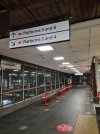
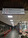
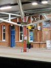
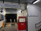
Looks pretty good. We were told we'll be seeing the double arrow logo alot!
The arrows are far and away the worst part of this for me: I'm perfectly happy with neutral signage, the new font is OK (though it will date faster than Rail Alphabet) and black-on-white is my preference for signs; but the arrows are not as clear as the older ones, particularly at 45 degrees, thanks to the shaft not having enough contrast with the head.Not sure I like it. The arrows don't go with the font, and using the British Rail sign to mean "to the trains" is ambiguous (the picture of a train is clearer), though does at least provide some colour.
Dated and clunky.
Also, better and clearer to have the arrow on the side of the sign to which it is pointing (which even BR did).
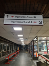
I'm a fan. It's familiar yet modern at the same time. It certainly is clearer than the existing muddy dark signage.
One thing I don't understand is why the double arrow is included on the platform signs, reading the guidelines I thought it was only to appear on the station name boards or when directing to the station itself. I could only think there are platforms at Stafford which aren't for trains?
Also can't help but think the arrow should be on the side of the direction, a bit like this:
Better than those awful Virgin era signs anyway!
You'll never convince me to be a fan of yellow text on a grey background.I like those. Quite stylish and still clear.

I'm a fan. It's familiar yet modern at the same time. It certainly is clearer than the existing muddy dark signage.
One thing I don't understand is why the double arrow is included on the platform direction signs, reading the guidelines I thought it was only to appear on the station name boards or when directing to the station itself. I could only think there are platforms at Stafford which aren't for trains?
Also can't help but think the arrow should be on the side of the direction, a bit like this:
View attachment 105123
The Rail Alphabet 2 typeface was made by Margaret Calvert and Henrik Kubel, the same pair that made New Rail Alphabet in 2009 and Calvert being half of the duo that made the original Rail Alphabet, so it was done by very good handsThe font looks remarkably just like some of the lighter weight versions of the original RA BR used every now and then, hope noone was paid too much
It's the various TOC creative teams interpreting what's set out in the design manual. I'd have distributed each team all the electronic files of sign templates for absolute visual consistency.Is NR providing the new signage or are the TOCs doing the work while following the requisite design standards? If it's the latter this would explain what appear to be inconsistencies and horrors such as the temporary looking signage on the Settle & Carlisle line.
It's the various TOC creative teams interpreting what's set out in the design manual. I'd have distributed each team all the electronic files of sign templates for absolute visual consistency.
And would ensure consistency.To be honest I'd just contract one company to do the job nationally, much easier and probably cheaper due to it being in bulk.
GWR has kind of had a go at RA2. They have chosen to basically completely ignore the guidelines though. They've used the bolder font and adding their logo banner along the bottom with the double arrow in green, so GBR will need to go back through and redo it again when they eventually come in.
https://twitter.com/GWRHelp/status/1458089698732171273
Looks much better with a bit of weight to it.GWR has kind of had a go at RA2. They have chosen to basically completely ignore the guidelines though. They've used the bolder font and adding their logo banner along the bottom with the double arrow in green, so GBR will need to go back through and redo it again when they eventually come in.
https://twitter.com/GWRHelp/status/1458089698732171273
The whole point of GBR (in terms of branding at least) is to unify everything like signs, brands, etc as it's got out of control at this stage though.No one has said it will need redoing. No one knows what GBR will do with local branding.
This may be the case and it's entirely EMRs decision to do that, but they're throwing money away as franchising is dead so their brand will eventually turn into GBR and the EMR brand, like GWR, is expected to disappear with it.EMR are still repainting and rebranding stations at a pace now. It was always meant to be the same brand regardless of who won the franchise.
The whole point of GBR (in terms of branding at least) is to unify everything like signs, brands, etc as it's got out of control at this stage though.
In terms of the new signage guidelines, the point is that it's supposed to all match no matter where on the network you are, so stations here and there ignoring the guidelines would defeat that purpose. Even in the unexpected event they did keep current brands like GWR, the signs would all still be replaced and make no mention of them as the double arrow is there for identification instead.
This may be the case and it's entirely EMRs decision to do that, but they're throwing money away as franchising is dead so their brand will eventually turn into GBR and the EMR brand, like GWR, is expected to disappear with it.
