• Our booking engine at tickets.railforums.co.uk (powered by TrainSplit) helps support the running of the forum with every ticket purchase! Find out more and ask any questions/give us feedback in this thread!

Stations rebranded to Great British Railways design / Rail Alphabet 2

ainsworth74

Forum Staff
Staff Member
Global Moderator
Joined
16 Nov 2009
Messages
27,686
Location
Redcar
Personally I'm not convinced that the station name boards need three support columns, each with three fixings, but maybe the signs are really heavy? In which case, why not make them lighter?
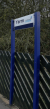
I recommend avoiding Yarm in that case if you're concerned about excessive supports for station signs!

Yarm.png

(Used to be even worse as a previous incarnation was just the word "Yarm" without the TPE branding on the right hand side!!)

Photo not mine, source ASD Lighting here.


The double arrow does add a splash of colour, to be fair to it.
Yes! Having seen them for real now on the S&C I think the new signs are actually really good but are in desperate need of a splash of colour as probably a bar on the bottom or via a logo such as the double arrow. But if you added that I think they're very good and a significant improvement on some TOC efforts.
 
Sponsor Post - registered members do not see these adverts; click here to register, or click here to log in
R

RailUK Forums

Goldfish62

Established Member
Joined
14 Feb 2010
Messages
10,073

Peter Sarf

Established Member
Joined
12 Oct 2010
Messages
5,706
Location
Croydon
Conspiracy theory.

When Network Rail started rolling out their new signs the government realised it was a lost opportunity to capitalise on the cost of "re-branding" so dreamt up a new entity called GBR.

I'll get my coat !.
 

JaJaWa

Established Member
Joined
14 Feb 2013
Messages
1,705
Location
Conspiracy theory.

When Network Rail started rolling out their new signs the government realised it was a lost opportunity to capitalise on the cost of "re-branding" so dreamt up a new entity called GBR.

I'll get my coat !.
Peter Hendy is behind both of them I believe
 

Sm5

Member
Joined
21 Oct 2016
Messages
1,013
Whats happening with the old signage ?

any chance for collectors to buy ?


Might find out in a day or two, a station local to me had all its “Southern” signs removed, so I assume the new signs are coming.
Apologies missed this…

Belmont station, a few weeks ago it had all southern Signage on the platform lampposts.

Last week (and still today) its all missing, aside of the street entry signs.
Was wondering if it was an alphabetical order thing, as Sutton ontowards London still have signs.

I was going to look at Banstead too when filming RHTT trains at 1am ish..but that station is a little “rural” for that hour.
 
Last edited:

Legolash2o

Member
Joined
27 Sep 2018
Messages
601
Not sure if it's been mentioned. Broomfleet and Ferriby on the Hull line have the new signs.
 
Last edited:

py_megapixel

Established Member
Joined
5 Nov 2018
Messages
6,673
Location
Northern England
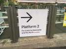
The big arrows remind me of Ikea. That's not a bad thing though, as their wayfinding is usually quite good (especially compared to other big shops!)
 

Peter Sarf

Established Member
Joined
12 Oct 2010
Messages
5,706
Location
Croydon
And not very straight!

(Or is the fence off level and it's been done with a spirit level?)
You are correct the barrier is on a slope. Must be because, on a second look, I note the posts are in line with the sides of the sign so I guess posts are vertical.

Looks nice and clear. Well until someone stands in front of it !. Incidentally has anyone noticed on stations that sometimes the information is obscured by another sign nearby. Why not put one sign above the other thus saving on posts or brackets.
 

Christmas

Member
Joined
10 Mar 2018
Messages
384
It's certainly clear, though I do think a thin red or blue band at the top or bottom (or both) would make a world of difference to how good it looks without in any way affecting that.
I'm in total agreement and I would be astonished if someone from the "powers that be" doesn't observe this forum.
 

TUC

Established Member
Joined
11 Nov 2010
Messages
3,614

Latest: GBR Signage Tracker https://gbrsignage.glide.page


As various Northern stations have begun their rebrand to the Great British Railways design / Rail Alphabet 2, we may need a new thread to keep track of this.

Examples I've found on Twitter of rebranded platform signs so far are (linked):
Paddington is confirmed as the first 'major station' to get the new signs. Northern's new timetable also uses the font.
They look like what I'd unfortunately expect from the public sector. Cheap, unimaginative and soulless.
 

py_megapixel

Established Member
Joined
5 Nov 2018
Messages
6,673
Location
Northern England
This is an extremely circular argument.

While a splash of colour would be nice, I'm yet to hear any non-enthusiast person I've talked to complain about the signs... they're serving their purpose fine.
 

Horizon22

Established Member
Associate Staff
Jobs & Careers
Joined
8 Sep 2019
Messages
7,584
Location
London
It's certainly clear, though I do think a thin red or blue band at the top or bottom (or both) would make a world of difference to how good it looks without in any way affecting that.

I agree. A tiny splash of colour or a small logo (even in B&W) on some of these signs wouldn't hurt at all.
 

BrianW

Established Member
Joined
22 Mar 2017
Messages
1,460
I agree. A tiny splash of colour or a small logo (even in B&W) on some of these signs wouldn't hurt at all.
Any advocates for chocolate-and-cream (in appropriate locations of course!)
As we've now seen at Coventry, new permanent signage will include the double arrow in red
Hoping the seats and yellow lines on the platforms got Listed Building Consent:
 

Domh245

Established Member
Joined
6 Apr 2013
Messages
8,426
Location
nowhere
I'm also curious as to what effect the double arrow has on readability. Whilst I doubt they'd put it on if it had a significant negative impact, it can't help matters, surely? Certainly can't be better than a plain stripe at an edge?
 

py_megapixel

Established Member
Joined
5 Nov 2018
Messages
6,673
Location
Northern England
The fitters of new signs vinyl coverings to Northern stations seem to be carefully skirting around the Greater Manchester area, stopping at Handforth, Poynton and Ashley. Is this a deliberate decision for some reason?

It's a shame - the ones in GM look particularly tatty, as in addition to being old and grubby they have the outdated GMPTE logo when it should be TfGM.
Is there anywhere in GM that has the new design?
 

Tio Terry

Member
Joined
2 May 2014
Messages
1,178
Location
Spain
Any advocates for chocolate-and-cream (in appropriate locations of course!)

Hoping the seats and yellow lines on the platforms got Listed Building Consent:
I can't speak for Coventry specifically but with other projects there has been no issues with yellow lines or tactile paving being added to platforms because they are safety features. Sometimes it's only the buildings that are Listed, the platforms are not included.
 

jonnyfan

Member
Joined
6 Apr 2013
Messages
221
Location
Manchester
The fitters of new signs vinyl coverings to Northern stations seem to be carefully skirting around the Greater Manchester area, stopping at Handforth, Poynton and Ashley. Is this a deliberate decision for some reason?

It's a shame - the ones in GM look particularly tatty, as in addition to being old and grubby they have the outdated GMPTE logo when it should be TfGM.
Is there anywhere in GM that has the new design?
There have been two that I've seen, Trafford Park and Heald Green have had the new vinyls. No TfGM logo on them, just the same as all the other Northern examples.
 

Top