-
Our booking engine at tickets.railforums.co.uk (powered by TrainSplit) helps support the running of the forum with every ticket purchase! Find out more and ask any questions/give us feedback in this thread!
You are using an out of date browser. It may not display this or other websites correctly.
You should upgrade or use an alternative browser.
You should upgrade or use an alternative browser.
Branding and marketing blunders or failures on the railway.
- Thread starter Christmas
- Start date
- Status
- Not open for further replies.
Sponsor Post - registered members do not see these adverts; click here to register, or click here to log in
R
RailUK Forums
Even better, when they had a "Five Go To Devon" series, which coincided with the first of the several shortages of Class 800s, it became known at Paddington as "Five vice Ten Go To Devon".I'd be interested to know how successful or not GWR's Famous Five marketing has been given most of the replies to tweets / Facebook posts I saw back when they were started were along the lines of "Five go nowhere fast" etc.
matt_world2004
Established Member
- Joined
- 5 Nov 2014
- Messages
- 4,504
Another one I can remember on a similar theme. Tfl forgot to cancel their YouTube advertising for night overground when lockdown 1 started advertising all the places you could go in Shoreditch that were now closed. On a line that didn't run during the day.
"We're a Virgin company so we love to talk. We think it comes from Richard - he loves a good chinwag"
As seen on Virgin Trains East Coast on something like day three of operations. The staff were all still wearing their old East Coast uniforms but we were expected to believe that because it was Virgin everything was somehow magically groovy. I shudder at the memory.
As seen on Virgin Trains East Coast on something like day three of operations. The staff were all still wearing their old East Coast uniforms but we were expected to believe that because it was Virgin everything was somehow magically groovy. I shudder at the memory.
Malcolmffc
Member
- Joined
- 19 Mar 2017
- Messages
- 300
Harold Hill
On Moderation
The Mother of all marketing errors was 'HS2'. EC1 Extra Capacity One would've got more support / sympathy
43096
On Moderation
- Joined
- 23 Nov 2015
- Messages
- 15,362
On the contrary, it was a very good design. So you didn’t understand the construction (building blocks) or petroleum (wavy lines for liquid) symbols, then? It wasn’t that much of a stretch to see sheets of metal in the metals sector symbol, either.I gather the EWS livery was unpopular when it was introduced as it was an American livery adapted for the job.
As far as 'fails' go, I've never really liked the Railfreight sub-sector logos. They are a bit like having a map without a legend. The coal one broadly makes sense, but the rest have a whiff of letting a graphic artist have too much free reign over a simple job. In terms of overall accessibility and ease of interpretation they are a bit rotten really.
D821
Member
Wavy lines indicate a fluid, not what type of fluid it is. Sheets could be metal, wood or some other substance.
If you already know what the sectors of rail freight are, it's an easy fit. I like the logos myself, but I don't think they're self explanatory.
If you already know what the sectors of rail freight are, it's an easy fit. I like the logos myself, but I don't think they're self explanatory.
Alanko
Member
On the contrary, it was a very good design. So you didn’t understand the construction (building blocks) or petroleum (wavy lines for liquid) symbols, then? It wasn’t that much of a stretch to see sheets of metal in the metals sector symbol, either.
'General' and 'Distribution' could also be building materials, viewed from different angles, if they are interpreted as building blocks or slabs. Petroleum could be any liquid, so you would have to know that it was the only liquid with a dedicated sub sector. Does any theme tie the red symbols together? Or the blue ones? It needs a legend to decipher so I don't think it works.
43096
On Moderation
- Joined
- 23 Nov 2015
- Messages
- 15,362
Given that it won awards, and is still heralded now as a re-branding programme that worked, it rather suggests that you're in a rather small minority.'General' and 'Distribution' could also be building materials, viewed from different angles, if they are interpreted as building blocks or slabs. Petroleum could be any liquid, so you would have to know that it was the only liquid with a dedicated sub sector. Does any theme tie the red symbols together? Or the blue ones? It needs a legend to decipher so I don't think it works.
pdeaves
Established Member
I think the logic behind the symbols requires a bit of 'inside' (or enthusiast) knowledge. The symbols worked, though, in separating out different bits of the sector. They could have been anything as far as the public was concerned, but worked in showing 'the red diamond lot' was different to 'the blue wiggle lot'.Given that it won awards, and is still heralded now as a re-branding programme that worked, it rather suggests that you're in a rather small minority.
43096
On Moderation
- Joined
- 23 Nov 2015
- Messages
- 15,362
But given the topic is "branding and marketing blunders or failures", you cannot say that the Railfreight branding can be deemed that, just because someone doesn't 'get' the branding. Given that it won awards for the way it changed the culture of the Railfreight business, it is in fact completely the opposite of this thread's title.I think the logic behind the symbols requires a bit of 'inside' (or enthusiast) knowledge. The symbols worked, though, in separating out different bits of the sector. They could have been anything as far as the public was concerned, but worked in showing 'the red diamond lot' was different to 'the blue wiggle lot'.
pdeaves
Established Member
And I was agreeing with that!But given the topic is "branding and marketing blunders or failures", you cannot say that the Railfreight branding can be deemed that, just because someone doesn't 'get' the branding. Given that it won awards for the way it changed the culture of the Railfreight business, it is in fact completely the opposite of this thread's title.
xotGD
Established Member
- Joined
- 4 Feb 2017
- Messages
- 6,093
It's the whole notion of subsectorisation to that level that to my mind was the failure, not the silly logos.I think the logic behind the symbols requires a bit of 'inside' (or enthusiast) knowledge. The symbols worked, though, in separating out different bits of the sector. They could have been anything as far as the public was concerned, but worked in showing 'the red diamond lot' was different to 'the blue wiggle lot'.
Grumpy Git
On Moderation
The Mother of all marketing errors was 'HS2'. EC1 Extra Capacity One would've got more support / sympathy
"HS2" should be the new byword for ordering champagne and being served scrumpy.
Bletchleyite
Veteran Member
"HS2" should be the new byword for ordering champagne and being served scrumpy.
Good, champers is vile, I'd rather a pint of HS2 Scrumpy, or perhaps a shot of Northern Spirit
Grumpy Git
On Moderation
Good, champers is vile,
You need to drink the good stuff.
Dr Hoo
Established Member
The BR freight sub-sector logos were largely intended to show to customers (not the wider public or enthusiasts) that there were resources dedicated to THEIR business (rather than, say, likely to be borrowed to haul passenger trains).It's the whole notion of subsectorisation to that level that to my mind was the failure, not the silly logos.
At a more detailed level quite a few sub-classes were being adapted to their traffic, e.g. in terms of ballast, gearing or long range fuel tanks.
Doctor Fegg
Established Member
- Joined
- 9 Nov 2010
- Messages
- 1,845
Alphaline always struck me as RR Central/Wales & West looking at the success of "Transpennine Express" as a brand for RRNE's premium services and thinking "oh, we'll have a bit of that".In terms of brands that completely passed customers by, I think Alphaline is one of the most obscure- its astonishing how long it lasted in timetables and on the outside of trains. From what I can tell, all it meant was 'this train might have a payphone and air conditioning'!
Bletchleyite
Veteran Member
In terms of brands that completely passed customers by, I think Alphaline is one of the most obscure- its astonishing how long it lasted in timetables and on the outside of trains. From what I can tell, all it meant was 'this train might have a payphone and air conditioning'!
I actually thought it was a very good piece of marketing, of a rather German style "train category" nature. It was basically a guaranteed 158 which meant aircon*, reasonable seats (albeit no legroom), trolley service and secondarily a payphone. The strapline was "the nice and straightforward way to travel" - single class, only walk-up fares.
* Back then it actually did. 158 aircon only became awful when non-CFC refrigerants had to be used; before that they were like stepping into a fridge. I remember this being quite a novelty compared with non-aircon 14x/15x and Mk2s on which it never really worked properly.
Even better, when they had a "Five Go To Devon" series, which coincided with the first of the several shortages of Class 800s, it became known at Paddington as "Five vice Ten Go To Devon".
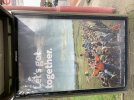
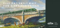
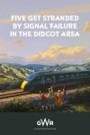
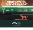
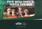
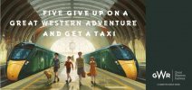
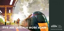
There are some quite good spoofs out there of those, I've attached the ones I've come across.
- Five patiently wait for a trained driver
- Five stranded at the beach
- It's already Thursday - planned your bus replacement service?
- Five get stranded by signal failure in the Didcot area
- Timmy says it's quicker by boat
- Five wish they'd taken the bus
- Five give up on a Great Western adventure and get a taxi
- Five are late for work again
Attachments
-
 2017-10-03 17.19.48.jpg73.3 KB · Views: 112
 -
 2017-10-04 10.31.56.jpg115.9 KB · Views: 110
 -
 2018-03-17 16.24.27.jpg77.4 KB · Views: 111
 -
 2018-03-17 16.24.31.jpg69.7 KB · Views: 110
 -
 2018-03-17 16.24.34.jpg67.5 KB · Views: 108
 -
 2018-03-17 16.24.46.jpg74.9 KB · Views: 110
 -
 2018-03-17 16.24.50.jpg61.8 KB · Views: 115
Last edited:
Has anyone mentioned those Vivo or Vero cars on the FGW Hst that had tv screens in the back of the seats in around 2006/7?
I imagine it cost hell of a lot and the car was decalled green too, it was only a few months before it was all switched off and you couldn’t do anything with the screens.
I imagine it cost hell of a lot and the car was decalled green too, it was only a few months before it was all switched off and you couldn’t do anything with the screens.
D6130
Established Member
Fully agree.....Prosecco is far nicer - and cheaper. Valdobbiadine anyone?Good, champers is vile, I'd rather a pint of HS2 Scrumpy, or perhaps a shot of Northern Spirit
Peter Mugridge
Veteran Member
I think it was called Volo?Has anyone mentioned those Vivo or Vero cars on the FGW Hst that had tv screens in the back of the seats in around 2006/7?
I imagine it cost hell of a lot and the car was decalled green too, it was only a few months before it was all switched off and you couldn’t do anything with the screens.
The only thing I ever used the screens in them for was the scrolling map display, but rather annoyingly it had to be kept active by touching it every couple of minutes or it would turn itself back to the menu page.
Grumpy Git
On Moderation
Saying "prosecco is far nicer" is like saying bitter is nicer than lager.Fully agree.....Prosecco is far nicer - and cheaper. Valdobbiadine anyone?
Cheap champagne is nastier than Carling, wheteas decent gear is to be savoured.
Some on here need to stop acting like trainspotters and get out more.
D6130
Established Member
Sorry.....forgot to hit the smiley button! BTW, I get out quite a lot - mainly to Italy - hence the bubbly drink reference, which was meant to be humorous!Saying "prosecco is far nicer" is like saying bitter is nicer than lager.
Some on here need to stop acting like trainspotters and get out more.
61653 HTAFC
Veteran Member
Criticism of the "frown" logo happened on day one. A bad logo is a bad logo regardless of the quality of the product.I think we only say that because the brand has been tainted by Northern being awful. Same with Connex really.
If Northern's franchise plans had worked, people would be talking about the effectiveness of their simple no-nonsense appearance.
Must say I agree with the apparent minority who found the Railfreight sub-sector markings a bit confusing. They looked cool, but it never struck me as obvious what each one was supposed to symbolise. They weren't a million miles away from the British Airways "Ethnic" tailfin designs that were almost universally ridiculed. They may have won awards but that isn't a universal gold-standard: plenty of awful films have won Oscars.
Bletchleyite
Veteran Member
Has anyone mentioned those Vivo or Vero cars on the FGW Hst that had tv screens in the back of the seats in around 2006/7?
I imagine it cost hell of a lot and the car was decalled green too, it was only a few months before it was all switched off and you couldn’t do anything with the screens.
It was a good idea overtaken by circumstances, namely that pretty much everyone who wants to watch films on a train now has their own device on which to do so.
pdeaves
Established Member
Yes, Volo. It was mainly silver with some green text. In my opinion a good idea that was overtaken by personal technology.I think it was called Volo?
The only thing I ever used the screens in them for was the scrolling map display, but rather annoyingly it had to be kept active by touching it every couple of minutes or it would turn itself back to the menu page.

ChiefPlanner
Established Member
Exactly - it also represented a considerable notch up in customer service and "quality" , recalling the sometimes dreadful experiences of the control organisations in nicking freight locomotives for odd reasons - perhaps one of the worst examples which I recall involving a control office "somewhere in Wiltshire" pinching a 47 off a critical automotive train to take some ECS for a race meeting in Chelternham.The BR freight sub-sector logos were largely intended to show to customers (not the wider public or enthusiasts) that there were resources dedicated to THEIR business (rather than, say, likely to be borrowed to haul passenger trains).
At a more detailed level quite a few sub-classes were being adapted to their traffic, e.g. in terms of ballast, gearing or long range fuel tanks.
Recall how common user "freight" engines were maintained and never cleaned , such that a wipe on the bodyside to show the painted number and not much else. Standards in dedicated depots were very much improved.
Yes, Volo. It was mainly silver with some green text. In my opinion a good idea that was overtaken by personal technology.
View attachment 105983
To be honest it was quite a few years before decent smart phones were mainstream. I think people just weren’t that fussed or bored enough to walk to the cafe carriage to spend money buying the scratch card needed to log in. You also needed headphones to use them. I’m pretty sure eventually they made it free but soon enough they just weren’t even switching them on.
- Status
- Not open for further replies.