• Our new ticketing site is now live! Using either this or the original site (both powered by TrainSplit) helps support the running of the forum with every ticket purchase! Find out more and ask any questions/give us feedback in this thread!

New National Rail website

Status
Not open for further replies.

yorksrob

Veteran Member
Joined
6 Aug 2009
Messages
41,296
Location
Yorks
New web site is absolutely crap as compared with the old one, its hard work when you want to look at forthcoming engineering works. Why can,t they leave things alone, some things work Ok for years before some idot comes along and changes things and often no longer works properly.

I agree, the forthcoming engineering works is another blind spot.

The cynic in me wonders whether it's a deliberate ploy to obfuscate various upcoming detrimental changes to the fares system (I'm sure they'd rather we all tapped in blindly without knowing what we were paying).
 
Sponsor Post - registered members do not see these adverts; click here to register, or click here to log in
R

RailUK Forums

GWVillager

Member
Joined
2 May 2022
Messages
833
Location
Wales & Western
New web site is absolutely crap as compared with the old one, its hard work when you want to look at forthcoming engineering works. Why can,t they leave things alone, some things work Ok for years before some idot comes along and changes things and often no longer works properly.
The old site definitely needed changing - it looked like it was designed in 2002. But this new one is somehow worse!
 

MikeWM

Established Member
Joined
26 Mar 2010
Messages
4,610
Location
Ely
The old site definitely needed changing - it looked like it was designed in 2002.

But it worked, so why did it 'need changing'? As far as I'm concerned, 'looks modern' is far, far down my list of requirements, with 'does what I need it to do' at the top. And that's before you take into account that 'looks modern' actually means 'far less usable' even if it does work properly, given the tedious tendancy in 'modern' web design to put less and less useful information on any given page and require vast amounts more scrolling around than before.

I'm not saying the old design was perfect - I cursed at it a number of times over having to continually scroll the journey planner results to the top to dismiss the stupid modal 'some of these journeys need more than one ticket' box - but it was much, much better than what has replaced it.
 

GWVillager

Member
Joined
2 May 2022
Messages
833
Location
Wales & Western
But it worked, so why did it 'need changing'? As far as I'm concerned, 'looks modern' is far, far down my list of requirements, with 'does what I need it to do' at the top. And that's before you take into account that 'looks modern' actually means 'far less usable' even if it does work properly, given the tedious tendancy in 'modern' web design to put less and less useful information on any given page and require vast amounts more scrolling around than before.

I'm not saying the old design was perfect - I cursed at it a number of times over having to continually scroll the journey planner results to the top to dismiss the stupid modal 'some of these journeys need more than one ticket' box - but it was much, much better than what has replaced it.
Oh, I agree, I’d much rather it. But such an old website is really not a great look to new passengers or foreign visitors.

Again, this new website is not the solution, but there was a need for change.
 

superkopite

Member
Joined
14 Jan 2016
Messages
210
Not sure I have seen it mentioned already..

Has anyone managed to workout how to see the actual origin/destination of the ticket before you are handed off?

As an example https://www.nationalrail.co.uk/jour...gHour=15&leavingMin=15&adults=1&extraTime=0#O

I planned a journey from BTN to London Terms. I selected the ticket for £21.50, but could not see the destination.

It wasn't until after handoff that it was revealed to be a ticket to London Thameslink. There are times when this might be appropriate, but other times I would much rather buy a ticket to London Terminals. At the very least, I need to know what I am buying before I commit
 

MikeWM

Established Member
Joined
26 Mar 2010
Messages
4,610
Location
Ely
Oh, I agree, I’d much rather it. But such an old website is really not a great look to new passengers or foreign visitors.

Again, this new website is not the solution, but there was a need for change.

I'd have to disagree, I don't see any need whatever for 'change for the sake of change'. If you're adding new functionality, or speeding it up, or delivering a better UI experience, fair enough. But if it works well as it is and you're not going to add anything useful to it by changing it, who cares if it just looks a bit old?

And if you're going to make all those things worse (less functionality, slower, worse UI) then I'd much rather you left well alone. That applies to most website redesigns in the last 20 years or so, not just the NR one, but the NR one is increasingly a perfect example of just how bad you can make things, without adding any new value whatever.
 

Silenos

Member
Joined
13 Dec 2022
Messages
308
Location
Norfolk
I'd have to disagree, I don't see any need whatever for 'change for the sake of change'. If you're adding new functionality, or speeding it up, or delivering a better UI experience, fair enough. But if it works well as it is and you're not going to add anything useful to it by changing it, who cares if it just looks a bit old?

And if you're going to make all those things worse (less functionality, slower, worse UI) then I'd much rather you left well alone. That applies to most website redesigns in the last 20 years or so, not just the NR one, but the NR one is increasingly a perfect example of just how bad you can make things, without adding any new value whatever.
In addition, you could argue that a website with an antiquated look was an accurate depiction of the railway it served.

On the other hand, I suppose a website that is an unusable mess, ignoring the needs of its users in favour of the flashy and impractical, is an even better reflection of the current national network.
 

Phil R

Member
Joined
18 Jan 2020
Messages
77
Location
Guildford
It's impossible to overstate just how crap this new website is.

Put in a journey with multiple legs and its telling me that part of it has a replacement bus. Only you can't actually open out the journey to find out where the replacement bus is - oh no.

I hope whoever's come up with it hasn't been paid for it.
Agreed. I tried to use this at the weekend when there was a farcification of weather and ASOS-related issues and whilst it told me I had a 4 leg journey, as one leg was cancelled it didn't have any fares for sale and this was seemingly the reason for not saying what the four legs would have been anyway - just giving departure and would-be final arrival times. If you already have a ticket e.g. you are on your return journey, you wouldn't necessarily need to buy one, so it's a bit of a misnomer being labelled a journey planner. Result was that I worked out my own journey plan in stages using RTT and my geographical knowledge, but which wasn't necessarily the most efficient. For anyone without the geography, possibly snookered if there's issues on different legs of the various options, giving the impression no journey is possible.
 

MikeWM

Established Member
Joined
26 Mar 2010
Messages
4,610
Location
Ely
In addition, you could argue that a website with an antiquated look was an accurate depiction of the railway it served.

On the other hand, I suppose a website that is an unusable mess, ignoring the needs of its users in favour of the flashy and impractical, is an even better reflection of the current national network.

Very good :E
 

AdamWW

Established Member
Joined
6 Nov 2012
Messages
4,456
Agreed. I tried to use this at the weekend when there was a farcification of weather and ASOS-related issues and whilst it told me I had a 4 leg journey, as one leg was cancelled it didn't have any fares for sale and this was seemingly the reason for not saying what the four legs would have been anyway - just giving departure and would-be final arrival times. If you already have a ticket e.g. you are on your return journey, you wouldn't necessarily need to buy one, so it's a bit of a misnomer being labelled a journey planner. Result was that I worked out my own journey plan in stages using RTT and my geographical knowledge, but which wasn't necessarily the most efficient. For anyone without the geography, possibly snookered if there's issues on different legs of the various options, giving the impression no journey is possible.

I had that problem - maybe I'm missing something but it seems that as soon as any leg is cancelled in a journey it removes the ability to see the different stages, making it hard work to find out which bit is cancelled.
And didn't the old one offer to find you an alternative?

In the very short time using the new planner I happened to look up a journey starting with one stop on a line with a frequent service, changing onto an hourly one. Because the optimal train for that one stop was cancelled it just showed the whole trip as cancelled, making it look as if I'd have to travel an hour later, rather than just start slightly earlier (or walk!)

Also once the first leg of a journey has started I can't see any way of getting information about each leg. Maybe I'm unusual in sometimes wanting to know about a journey I've already started on?

It all seems like a backwards step to me but as I said perhaps I'm just not using it properly.

But maybe this version won't sometimes fail to load unless I delete my cookies?
 

Mikey C

Established Member
Joined
11 Feb 2013
Messages
7,508
But maybe this version won't sometimes fail to load unless I delete my cookies?
The old website was the only one I've used in years/decades where I would get regular crashes, forcing me to clear the cookies for it.
 

TheLunaPark

Member
Joined
5 Mar 2022
Messages
37
Location
Somewhere
I think they’d have been better keeping the previous design and slowly making meaningful changes to bring it up to date. Make it responsive, bring the typography together better by dropping the random serif headings and maybe even using Rail Alphabet 2, migrate to a modern CMS and backend system etc.

Those saying the old one didn’t need changing, I’m afraid it doesn’t work like that. Over time you start to meet fewer accessibility needs, some of which are becoming law. Having a dated looking website also risks spoiling confidence in its use from those that are new to it such as tourists. People may question whether or not it’s even an official website. The app looks similarly dodgy and unprofessional nowadays.

Had they started with the old design and made genuine improvements and modernisations, they could have kept the content and information density pretty much the same much more easily, albeit adapted to modern laws and guidelines.
 

AdamWW

Established Member
Joined
6 Nov 2012
Messages
4,456
The old website was the only one I've used in years/decades where I would get regular crashes, forcing me to clear the cookies for it.

Likewise.

Also the only web site I use that opens pop-under advertising windows.

I think they’d have been better keeping the previous design and slowly making meaningful changes to bring it up to date. Make it responsive, bring the typography together better by dropping the random serif headings and maybe even using Rail Alphabet 2, migrate to a modern CMS and backend system etc.

Those saying the old one didn’t need changing, I’m afraid it doesn’t work like that. Over time you start to meet fewer accessibility needs, some of which are becoming law. Having a dated looking website also risks spoiling confidence in its use from those that are new to it such as tourists. People may question whether or not it’s even an official website. The app looks similarly dodgy and unprofessional nowadays.

Had they started with the old design and made genuine improvements and modernisations, they could have kept the content and information density pretty much the same much more easily, albeit adapted to modern laws and guidelines.

I can quite imagine that a fresh start to the underlying code was necessary.

But in producting the new version they seem to have dropped some important features on the way, and presumably that didn't have to be the case.
 

Bletchleyite

Veteran Member
Joined
20 Oct 2014
Messages
103,798
Location
"Marston Vale mafia"
I've had the new journey planner pop up, and wow, it's awful.

I think the user story must have been thus:

"As the funder of the nationalrail.co.uk site, I would like to make it as unusuable as possible, in order that everyone chooses to use Trainline instead so we can quietly close it down".

:)
 

MikeWM

Established Member
Joined
26 Mar 2010
Messages
4,610
Location
Ely
Those saying the old one didn’t need changing, I’m afraid it doesn’t work like that. Over time you start to meet fewer accessibility needs, some of which are becoming law.

Without measuring specific criteria - because then you end up coding to specific targets that may or may not be helpful overall, a bit like NHS targets, if you hit the target then it is 'good enough' - my experience has been that pretty much every website redesign feels less accessible than before the redesign, and that's even before you take into account people having to relearn how to do things on the site because everything has been moved around and the UI and interactions have changed. Accessibility seems to get much less attention in software development than it did 20 years ago, sadly, which is probably directly related to the rise of regulation around it. You do what the law requires and assume that's sufficient, whereas before you did what you thought was right, which was often better.

For example, I remember a period of time about 10 years ago when almost every website redesign went down the route of very low-contrast schemes that were totally unsuitable for use by people with various eyesight difficulties. They did it because that was the fashion, rather than because people were thinking about accessibility (or at best they were focusing on some types of accessibility while ignoring others). Fortunately that trend mostly reversed, and we actually have a lot of high-contrast design schemes nowadays, with 'dark modes' being fashionable.

But currently I fortunately have no accessibility needs. I wonder if someone that does would comment on whether they find the new site an improvement over the old? I'd guess not, but am willing to be proven wrong.

Had they started with the old design and made genuine improvements and modernisations, they could have kept the content and information density pretty much the same much more easily, albeit adapted to modern laws and guidelines.

Yes, which also would have reduced the risk of inadvertently breaking things.
 

Watershed

Veteran Member
Associate Staff
Senior Fares Advisor
Joined
26 Sep 2020
Messages
13,898
Location
UK
The major functionality the new journey planner is missing is the ability to replan around disruption. This was something the old journey planner did very well, indeed I can't think of any other sites that offer something equivalent. Most just state that a given train is delayed or cancelled and leave you to work out what alternatives there are - perhaps fine if just using a direct train, but it's as good as useless once connections become involved. It also means you're not shown alternative routes with changes when direct trains are disrupted.

Furthermore, journeys without fares seem to have the "Journey details" button disabled - so you have to guess where you're supposed to change, if it's not a direct train! When combined with Avanti's fake "reservations compulsory" flag it results in nonsense such as this:
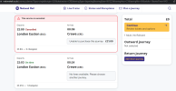
1702050815996.png
Screenshot showing NRE results for a search from London Euston to Crewe tonight, showing results at 22:00 (cancelled direct train) and 22:03 ('on time' with 1 change but no indication of where the change takes place)

The 22:00 Euston to Crewe has been cancelled tonight, hence reservations have been blocked - resulting in no fares being available. This in turn disables the "journey details" button so you can't see intermediate calling points. Perhaps not the end of the world but it's poorly thought through.

Where this gets worse is when you consider that Avanti have added a Special Stop Order (SSO) on the 22:03 Manchester service for Stafford, allowing a connection onto a WMT Crewe service (this is what the second journey in the screenshot shows). But because this SSO hasn't been reflected in the reservations system, there is 'no availability' for taking the 22:03 from Euston to Stafford, hence no fare can be offered and again the 'journey details' option has been disabled, leaving you guessing where the change is supposed to take place.

It was not at all obvious to me what was going on until I looked at Avanti JourneyCheck together with a list of arrivals from Crewe and joined up the dots. If even an expert like me can be stumped, what chance does the average member of the public have?

Whoever's come up with the specification for this new site needs to have a long, hard think. Sadly I imagine people will be congratulating themselves on "successfully" completing the launch of the new journey planner.
 

ivorytoast28

Member
Joined
10 Dec 2018
Messages
213
Location
Sheffield
On mobile the live departures are dreadful.. I used to just type "ncl live dep" into google and it would display a compact mobile list. If I do the same now even though the search result will say "Newcastle live departures, it will just redirect to the home page and I'll have to fill out the query again. And then the display is horribly spread out so you cannot scroll through and it regularly stopped working entirely when trying to use mid journey
 

fandroid

Established Member
Joined
9 Nov 2014
Messages
1,922
Location
Hampshire
Well, the version on my Android phone looks exactly the same!
That was the app. If there's a new version, then it hasn't automatically updated, but still seems to function as before.

I see that the web version front page does look different.

5 mins later: I have another phone and I used that to open the NRE app from Playstore. That seems unchanged and the compact list of departures as described by @ivorytoast28 still appears.

7 mins later than that: although the list is no longer compact on the non-app version, I don't have any trouble scrolling through the departures list. I can imagine though that having a poor signal on a train could make it dodgy, and my local line's phone signal is awful with the WiFi close to useless.
 
Last edited:

Minstral25

Established Member
Joined
10 Sep 2009
Messages
1,873
Location
Surrey
Live departures are a mess - a simple list to click into but now massive blobs of information

Also they haven't sorted out cancellations - where a station is cancelled further along the journey, it still says it calls rather than cancelled until you click into the train detail. Needs to be upfront rather than hidden. Not useful.
 

trainJam

Member
Joined
26 May 2023
Messages
171
Location
West Midlands
The travel via option now has the wording of "Stopping at" and there is no "Via [including non-stop]" option.
Has this changed the functionality of this or is this just an aesthetic change because "Via" is too complicated?

Best example which comes to mind is "Via High Wycombe" where you go via HWY but don't always stop there.

Edit:
The 1145 Birmingham Moor Street to London Marylebone (which passes through HWY) is shown with "Stopping At" High Wycombe selected.

1702378763056.png
 
Last edited:

theageofthetra

On Moderation
Joined
27 May 2012
Messages
3,565
Location
Beckenham
That was the app. If there's a new version, then it hasn't automatically updated, but still seems to function as before.

I see that the web version front page does look different.

5 mins later: I have another phone and I used that to open the NRE app from Playstore. That seems unchanged and the compact list of departures as described by @ivorytoast28 still appears.

7 mins later than that: although the list is no longer compact on the non-app version, I don't have any trouble scrolling through the departures list. I can imagine though that having a poor signal on a train could make it dodgy, and my local line's phone signal is awful with the WiFi close to useless.
I'll try that, the new website is awful.
 

CaptainHaddock

Established Member
Joined
10 Feb 2011
Messages
2,464
On mobile the live departures are dreadful.. I used to just type "ncl live dep" into google and it would display a compact mobile list. If I do the same now even though the search result will say "Newcastle live departures, it will just redirect to the home page and I'll have to fill out the query again. And then the display is horribly spread out so you cannot scroll through and it regularly stopped working entirely when trying to use mid journey
I agree. With the old version I'd get up in the morning, switch my phone on, click on the shortcut I've saved to my home station and find out whether my train was running in seconds.

Now with the new version the shortcut defaults to the main National Rail site, so I type in my home station, then the site brings up an error and I realise it's defaulted to the journey planner not live departures. So I then have to come out of it, scroll down to live depsartures, type in my home station then have to scroll through loads of irrelevant information about trains I'm not interested in and, if I'm lucky, I might find the train I actually want to catch right at the bottom of a long list.

Progress?
 

OscarH

Member
Joined
15 Sep 2020
Messages
851
Location
Crawley
Whoever's come up with the specification for this new site needs to have a long, hard think.
If its like some rail retail projects, the spec may actually have been fine, but then the supplier delivers something that doesn't meet half the things they agreed to in their bid, and they just shrug and accept it and give them their money anyway
 

Mikey C

Established Member
Joined
11 Feb 2013
Messages
7,508
I always liked to create a pdf personal timetable, but can't see that functionality anymore, as the new website is obsessed with making you pick a specific time for your outbound and return train, as if it were a ticket booking service.

So useful to be able to print out a single summary page with all the return options, whether direct or indirect, and how long it took, e.g.

Screenshot 2023-12-14 090711.png
 

Benjwri

Established Member
Joined
16 Jan 2022
Messages
2,345
Location
Bath
I always liked to create a pdf personal timetable, but can't see that functionality anymore, as the new website is obsessed with making you pick a specific time for your outbound and return train, as if it were a ticket booking service.

So useful to be able to print out a single summary page with all the return options, whether direct or indirect, and how long it took, e.g.

View attachment 148504
Still exists, you can get to it from the main timetables page, still in the old style and only available on desktop.

Your personalised timetable​

You can make your own timetable and save it as a PDF document*. You can custom build the pocket timetable to your own requirements, with dates, times and up to 3 departure or arrival stations. There are also options to show intermediate stations or services from individual train companies. You can see timetables for the next 12 weeks, and they will include any changes to previously published train times.

* Please note, this function is currently only available on desktop.
 

Mikey C

Established Member
Joined
11 Feb 2013
Messages
7,508
Still exists, you can get to it from the main timetables page, still in the old style and only available on desktop.
That feels like a leftover from the old desktop version, rather than being integrated with the new main search function, and easily accessed. Handy to know it's still there though.
 
Status
Not open for further replies.

Top