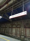
Side by side comparison - interesting. Looks awful. The arrow doesn't fit (looks like a child drew it), and the BR logo being overused. And the font looks clunky and awkward.
Get Best Impressions in.
The arrow indeed looks very unsuitable. Far too large in comparison to the text.