• Our new ticketing site is now live! Using either this or the original site (both powered by TrainSplit) helps support the running of the forum with every ticket purchase! Find out more and ask any questions/give us feedback in this thread!

Livery under Great British Railways

LNW-GW Joint

Veteran Member
Joined
22 Feb 2011
Messages
21,010
Location
Mold, Clwyd
Exactly. Pretty sure people that travel daily to and from Paddington to the West don't say they've 'been on an Azuma'. And why, when we're (hopefully) going for a united identity for our 'Great British' railway, would we stick with a Japanese word? It's a stupid name for a stupid train and to me, has always stood for cheap and nasty, poorly made rubbish.
The 800/801 series (IEP), on which the entire 80x production was based, was specified and procured by the government-owned DfT, and then passed on to GWR and LNER with almost no scope for change beyond paintwork and a few internals.
Your stupid, cheap and poorly made train is down to the DfT (with the 802s having a little FirstGroup variation).
What makes you think GBR train procurement will be any different, seeing as they will be working to DfT rules?

The politics said we needed a second UK-based train manufacturer to keep Bombardier honest, hence the Hitachi factory in Newton Aycliffe.
That sort of politics is still there (see the HS2 rolling stock procurement), only now there's CAF and Siemens with UK sites to keep busy too.
 
Sponsor Post - registered members do not see these adverts; click here to register, or click here to log in
R

RailUK Forums

ricj

Member
Joined
31 May 2022
Messages
32
Location
Guisborough
I wasn't suggesting trains will be any better or different under GBR, just voicing my disdain on those trains in general.
 

Energy

Established Member
Joined
29 Dec 2018
Messages
4,941
GWR and LNER with almost no scope for change beyond paintwork and a few internals.
IIRC VTEC (now LNER) was pretty insistent to get the buffet and red seats. GWR was unlucky.
(with the 802s having a little FirstGroup variation).
The GWR 802s had to be done to DfT spec. IIRC originally 222s were being considered until FG made the case for 802s.

The Hull Trains and TPE 802s only changed seat colour, carpets etc. for speed. HT’s 180s were falling apart and TPE needed more stock ASAP so they didn’t bother getting a new seat authorised until the Lumo order.
What makes you think GBR train procurement will be any different, seeing as they will be working to DfT rules?
Many of the civil servants at that time will no longer be at the DfT. There has been some willingness to learn with recent procurements being handled by TOCs.
 

Flinn Reed

Member
Joined
8 Dec 2017
Messages
209
It seems likely that any GBR livery would use the blue/red/white colours from the flag - but I hope this isn't the case. The variety of train liveries we have now across the different private operators shows the alternative colours etc that work well. Since Chiltern updated their branding, none of the TOCs have chosen to use red and blue together for their liveries (leaving only London Underground).

In particular, I think green would be a good choice for the brand. It links back to heritage of the railways in the UK, and blends in better with the countryside that many rail routes travel through. GWR is a good example of a more retro brand, but similar colours have also been chosen by London Northwestern, Southern, Avanti and Caledonian Express. GWR's livery is also very simple compared to some other operators, but the dark green colour means it stands out a lot more compared to white-based simpler liveries like Thameslink or Transport for Wales.

At least, I think something similar to GWR would work well for more regional and rural rail services, maybe some intercity routes too. But something brighter could be used for commuter routes. With more cities introducing TfL-style intermodal transport providers, like the Bee Network, it could make sense for the majority of commuter rail services to be branded for that particular city, rather than being common with the national rail network.
 

Bletchleyite

Veteran Member
Joined
20 Oct 2014
Messages
103,887
Location
"Marston Vale mafia"
With more cities introducing TfL-style intermodal transport providers, like the Bee Network, it could make sense for the majority of commuter rail services to be branded for that particular city, rather than being common with the national rail network.

Of course we had that before, with the same basic Regional Railways livery done in multiple sets of colours for different PTE areas, which gave both a BR "family" feel and a local one.
 

Meerkat

Established Member
Joined
14 Jul 2018
Messages
9,175
What were the owning group policies?
Stagecoach had a family livery (but had significant variations for express v metro), but First ended up with the localised GWR livery (but didn’t segregate locals from expresses).
 

LNW-GW Joint

Veteran Member
Joined
22 Feb 2011
Messages
21,010
Location
Mold, Clwyd
Arriva never seemed to have a house colour for trains.
ATW was close to the Arriva corporate green, but XC certainly wasn't nor were Chiltern or LO.
Arriva's Grand Central black/orange is about as far from their corporate colours as is possible to get.

National Express had a corporate core livery on ICEC, ONE and c2c (largely white), but they are long gone.
Virgin was recognisable with its corporate red and white on ICWC and XC (prior to transfer to Arriva) and then later on ICEC.
The IC225 and Azuma liveries are derivatives of that ICEC brand, rather than the preceding GNER blue with red stripe or NXEC white.

Abellio didn't seem to have a corporate livery in the UK, certainly nothing like its native NS yellow.

There were articles written in the past which on the one hand promoted corporate liveries for trains as being good for business, and on the other which said that separate liveries and branding made sure that the parent corporate brand was not at risk by having a poorly-viewed rail franchise.
Virgin and Stagecoach saw both sides of that argument.
FirstGroup/Trenitalia are probably even now preparing to dump their Avanti brand - the only uncertainty is the date, and whether the GBR version will continue with the same brand.
 
Last edited:

JLH4AC

Member
Joined
15 Jul 2023
Messages
171
Location
Market Rasen
Arriva never seemed to have a house colour for trains.
ATW was close to the Arriva corporate green, but XC certainly wasn't nor were Chiltern or LO.
Arriva's Grand Central black/orange is about as far from their corporate colours as is possible to get.
Arriva Trains Northern was also in Arriva corporate colours. Chiltern Railways and Grand Central were bought out by Arriva a long time into operations so they were unlikely to benefit from rebranding them, especially in the case of Grand Central which as an open-access operator benefits from not being seen as part of the franchise services. The London Overground is a concession so TfL controls the livery.
Abellio didn't seem to have a corporate livery in the UK, certainly nothing like its native NS yellow.
Abellio did have corporate livery in the UK, Greater Anglia (Which was the only franchise they operated outright in which the livery was not controlled by the franchise contact manager.) had a similar livery to their Surrey buses.
 
Last edited:

61653 HTAFC

Veteran Member
Joined
18 Dec 2012
Messages
18,505
Location
Yorkshire
Of course we had that before, with the same basic Regional Railways livery done in multiple sets of colours for different PTE areas, which gave both a BR "family" feel and a local one.
It wasn't all that consistent though. There was the basic Regional Railways "three stripe" livery that was an update of the Provincial Sector colours of the 1980s, and of the various PTE liveries only West Midlands and Greater Manchester were a colour-swapped version of Reggie Railways. Then there were all the different variations that stuck around for years after being discontinued such as Pacer blue and "Skipper" brown, and the "North West Express" version with the green stripe. Then there were the other PTE liveries which didn't follow the basic format of Regional Railways at all (T&W, Merseytravel, West Yorkshire)... plus the "Express" variant on the 158s (and a handful of 156s just prior to privatisation). I know I sound like a broken record here, but things just weren't as settled and consistent as you're making out.
Arriva Trains Northern was also in Arriva corporate colours. Chiltern Railways and Grand Central were bought out by Arriva so were unlikely to benefit from rebranding them, especially in the case of Grand Central which as an open-access operator benefits from not being seen as part of the franchise services. The London Overground is a concession so TfL controls the livery.
Very little of Arriva Trains Northern's fleet made it into the Arriva corporate colours, just a few 142s and 153s IIRC, along with the Mk2s for the Yorkshire 37-hauled services. Most was in either debranded Northern Spirit or an assortment of PTE colours with an Arriva logo slapped on. Some units still had their pre-privatisation liveries until Serco-NedRail Northern came along.
 

JLH4AC

Member
Joined
15 Jul 2023
Messages
171
Location
Market Rasen
Very little of Arriva Trains Northern's fleet made it into the Arriva corporate colours, just a few 142s and 153s IIRC, along with the Mk2s for the Yorkshire 37-hauled services. Most was in either debranded Northern Spirit or an assortment of PTE colours with an Arriva logo slapped on. Some units still had their pre-privatisation liveries until Serco-NedRail Northern came along.
That's why I said corporate colours, not corporate livery, The Northern Spirit livery was turquoise which is Arriva's main corporate colour, and even though they were meant to be debranded a notable number of Northern Spirit units still had the white Arriva logotype on them even long after Serco-NedRailways Northern had takeover.

Rebranding units in a timely manner was one of many things that many of the early operators of franchises were bad at.
 
Joined
9 Dec 2012
Messages
714
The SWR Livery with some red trimming added in around the doors or under the windows wouldn't look to shabby IMO , I. thinking what London Midland did with the lime green (albeit in a thicker form)
 

61653 HTAFC

Veteran Member
Joined
18 Dec 2012
Messages
18,505
Location
Yorkshire
That's why I said corporate colours, not corporate livery, The Northern Spirit livery was turquoise which is Arriva's main corporate colour, and even though they were meant to be debranded a notable number of Northern Spirit units still had the white Arriva logotype on them even long after Serco-NedRailways Northern had takeover.

Rebranding units in a timely manner was one of many things that many of the early operators of franchises were bad at.
The similarity between Northern Spirit's non-express livery and Arriva's corporate turquoise were just a coincidence though... and they weren't actually that similar. For one thing the NS base colour was quite a different shade of turquoise, with large green N motifs which made it look even less like Arriva's bus livery of the time. Not to mention that quite a large portion of their fleet they did manage to repaint was in either the Trans-Pennine magenta and gold (most of the 158s) or the WYPTE red variant of the Northern Spirit livery (some of the WY 158s). The only new stock Northern Spirit had (the 333s) were also delivered in a WYPTE-variant which they retained long after the Arriva takeover.

There's some rather selective interpretation of history going on in this discussion. Removing an old logo and slapping a new one on is just about the vaguest form of "rebranding" possible. In reality there has never really been a time where everything was uniformly liveried. Even under British Rail before sectorisation there were some DMUs in blue, some in blue & grey, and some in "refurbished" white with blue stripe... then there were oddities like the class 114 which had a unique South Yorkshire PTE livery.
 

JLH4AC

Member
Joined
15 Jul 2023
Messages
171
Location
Market Rasen
The similarity between Northern Spirit's non-express livery and Arriva's corporate turquoise were just a coincidence though... and they weren't actually that similar. For one thing the NS base colour was quite a different shade of turquoise, with large green N motifs which made it look even less like Arriva's bus livery of the time. Not to mention that quite a large portion of their fleet they did manage to repaint was in either the Trans-Pennine magenta and gold (most of the 158s) or the WYPTE red variant of the Northern Spirit livery (some of the WY 158s). The only new stock Northern Spirit had (the 333s) were also delivered in a WYPTE-variant which they retained long after the Arriva takeover.

There's some rather selective interpretation of history going on in this discussion. Removing an old logo and slapping a new one on is just about the vaguest form of "rebranding" possible. In reality there has never really been a time where everything was uniformly liveried. Even under British Rail before sectorisation there were some DMUs in blue, some in blue & grey, and some in "refurbished" white with blue stripe... then there were oddities like the class 114 which had a unique South Yorkshire PTE livery.
Yeah, it was a coincidence but it was likely a welcome one for Arriva as to the general public it is a similar enough shade of turquoise that could be passed off as intended by just placing a white Arriva logotype on the side, even if you don't accept that to be the case it can't be argued that Arriva wasn't attempting to slowly roll out the Northern turquoise and stone livery between 2001 and 2004 (It not being a well run franchisee did not help with speed of roll out). Arriva had no reason to rebrand the Trans Pennine Express units when they took over from MTL as in that same year plans to create the TransPennine Express franchise were announced. WYPTE paid for those units to be branded that way.

Yeah, people do seem to have a selective interpretation of history in this thread, mostly people who think the BR era was boring because they falsely believe that there was less variation than there was in reality, and people who act like rebranding especially when it is more involved than slapping new logos on units happens overnight.
 
Last edited:

Class 800

Member
Joined
5 Aug 2023
Messages
102
Location
London
I do wonder... assuming the Azuma/Evero/Paragon/whatever brand names for the IETs are going to be retired... will they be given different names? I feel like A-train or AT300s could work.
I was a fan of "InterCity SET" for Super Express Train - the original name used under the IEP proposals.

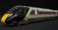
Someone did a render of an Azuma in the Swallow livery..
EC905CBDB3AD312C0A420F3932A3A15C6622053F


and also the InterCity 250 version of the livery (which is very nice apart from the misplaced yellow IMO).

9199CAB02EE61B32A987A66ADAA6DB9C8C6ECCB1


Unlike some, I do think it will look nice, provided the cab ends are optimized for a streamlined, curved design.

Though I think the word INTERCITY should perhaps be in a more modern alphabet - even RA2 will be fine.

The swallow could be replaced by an eagle on HS2 services (faster bird!)
 
Last edited:

sprinterguy

Established Member
Joined
4 Mar 2010
Messages
11,304
Location
Macclesfield
It wasn't all that consistent though. There was the basic Regional Railways "three stripe" livery that was an update of the Provincial Sector colours of the 1980s, and of the various PTE liveries only West Midlands and Greater Manchester were a colour-swapped version of Reggie Railways. Then there were all the different variations that stuck around for years after being discontinued such as Pacer blue and "Skipper" brown, and the "North West Express" version with the green stripe. Then there were the other PTE liveries which didn't follow the basic format of Regional Railways at all (T&W, Merseytravel, West Yorkshire)... plus the "Express" variant on the 158s (and a handful of 156s just prior to privatisation). I know I sound like a broken record here, but things just weren't as settled and consistent as you're making out.
The TWPTE and Merseytravel identities did follow the standard Regional Railways format, with different colour bands matching the vertical dimensions and general layout of those of the general RR scheme, but with white coloured window bands (as per the second GMPTE scheme) instead of a darker colour.

The second WYPTE red scheme also followed this to a lesser extent with the white or cream bodyside band matching the combined thickness of the white and light blue RR stripes.

Very little of Arriva Trains Northern's fleet made it into the Arriva corporate colours, just a few 142s and 153s IIRC, along with the Mk2s for the Yorkshire 37-hauled services. Most was in either debranded Northern Spirit or an assortment of PTE colours with an Arriva logo slapped on. Some units still had their pre-privatisation liveries until Serco-NedRail Northern came along.
To be fair, all of ATN's 153s received Arriva corporate livery as well as 25 out of their 29 class 142s (all but 4 of the 5 that had received Northern Spirit livery).

Granted there were only twelve 153s, and everything (the 156s and 158s, and those residual 142s) that had only relatively recently been reliveried by Northern Spirit remained understandably untouched, and it is surprising that that small batch of eleven 150/2s still in Regional Railways livery managed to dodge the turquoise paintbrush: But both NS and ATN only had around three years each to spread their respective corporate identities.
 
Last edited:

FlyingPotato

Member
Joined
23 Mar 2023
Messages
323
Location
Always moving
I think they'll introduce a brand new livery not keeping all the old ones, I'm sure some might stay the same like WMR.
But the thing is, a livery is an easy way to say it's different now, if it looks and feels the same, people might think nothing has changed.
So a livery is an easy way to market that this railway is better and nationalised
 

Russel

Established Member
Joined
30 Jun 2022
Messages
2,302
Location
Whittington

The white cab roof needs to be black, as that's the colour it'll end up over time anyway and the black band around the cab should start in line with the black band along the rest of the body side, other than that, I actually like it!
 

Class 800

Member
Joined
5 Aug 2023
Messages
102
Location
London
That looks fantastic and still modern - a consistent white down the side and a sans-serif font for the logo would make it perfect.

The white cab roof needs to be black, as that's the colour it'll end up over time anyway and the black band around the cab should start in line with the black band along the rest of the body side, other than that, I actually like it!
Agree with both of you.

I wonder if we should have white doors for contrast?

Also, the INTERCITY fits well over the kitchen side where there are no windows, but what about the non-kitchen side? Do we block out the windows?

Otherwise we could modify it to be InterCity-250 style with the INTERCITY in the white part?
 

Russel

Established Member
Joined
30 Jun 2022
Messages
2,302
Location
Whittington
Agree with both of you.

I wonder if we should have white doors for contrast?

Also, the INTERCITY fits well over the kitchen side where there are no windows, but what about the non-kitchen side? Do we block out the windows?

Otherwise we could modify it to be InterCity-250 style with the INTERCITY in the white part?

I'd suggest ditching the Intercity logo as it is, the font is dated and the position is too prominent...
 

Bletchleyite

Veteran Member
Joined
20 Oct 2014
Messages
103,887
Location
"Marston Vale mafia"
Like it used to be in the executive livery, and that looked good.

It looked dated and basic, and to be honest I dislike RA2, it's a clumsy font that has none of the cachet of the original. It isn't a suitable font for any branding, it's just a practical font for signage, though to be honest I'd just revert to RA1 for that, it looks much better and the pictograms are vastly superior, particularly the arrows.
 

whoosh

Established Member
Joined
3 Sep 2008
Messages
1,588
As an FYI, there are no Gatwick Express units in service on Great Northern anymore, and won’t be again any time soon. The /2 units are back south of the river now.

When 379s come along (eventually), someone needs to go on a windup and say that the black triangle is the new GBR symbol.


Found something better in my archive.
View attachment 162366
(This was an attempt to improve the rather dark and dull GWR colour scheme.
The present green is slightly too dark and too blue and has been accented with silver grey which gives a rather cold overall impression with only the yellow noses giving any relief.)

My scheme:
Body chrome green (lighter and less blue than the present colour) - similar to or same as BR locomotive green.
Black window ribbon. Indian red doors. Flash and waist band orange. Charcoal grey roof. Underframe etc dark grey.

However, it shows signs of of a possible general livery type.
The black window ribbon and grey roof are retained in all cases. The body, flash and waistband colours are varied in colour according to sector as is the logotype.
The waistband could also be omitted.

Dublin DART does Intercity!
 

Archie810

Member
Joined
25 Jan 2023
Messages
46
Location
Derbyshire
I was a fan of "InterCity SET" for Super Express Train - the original name used under the IEP proposals.

Someone did a render of an Azuma in the Swallow livery..
EC905CBDB3AD312C0A420F3932A3A15C6622053F


and also the InterCity 250 version of the livery (which is very nice apart from the misplaced yellow IMO).

9199CAB02EE61B32A987A66ADAA6DB9C8C6ECCB1


Unlike some, I do think it will look nice, provided the cab ends are optimized for a streamlined, curved design.

Though I think the word INTERCITY should perhaps be in a more modern alphabet - even RA2 will be fine.

The swallow could be replaced by an eagle on HS2 services (faster bird!)
Took a bit of artistic licence and tried to make the livery less defined by the profile of the train into more of a "one size fits all", also tried to make it a bit more modern. I know its not perfect, could still do with a bit of tweaking
1724760788065.png
 
Last edited:

Uncle Buck

Member
Joined
30 Jun 2020
Messages
62
Location
Glasgow
Took a bit of artistic licence and tried to make the livery less defined by the profile of the train into more of a "one size fits all", also tried to make it a bit more modern. I know its not perfect, could still do with a bit of tweaking
View attachment 164398
This is very impressive. I never liked the swallow livery, which I always felt was a bit ungainly. This is very sleek and fresh.
 

Top