-
Our booking engine at tickets.railforums.co.uk (powered by TrainSplit) helps support the running of the forum with every ticket purchase! Find out more and ask any questions/give us feedback in this thread!
You are using an out of date browser. It may not display this or other websites correctly.
You should upgrade or use an alternative browser.
You should upgrade or use an alternative browser.
Remaining Northern Line Bank upgrades following major blockade
- Thread starter Mikey C
- Start date
- Status
- Not open for further replies.
Sponsor Post - registered members do not see these adverts; click here to register, or click here to log in
R
RailUK Forums
Assuming they go back to the pre-closure timetable, the first southbound train at Bank is scheduled for 05:58.any idea when the first southbound train is tomorow?, just so happen to need to take it from Bank to London Bridge so may try take a ride
richardcoughla
Member


DanNCL
Established Member
I think it was pretty clear that was an (admittedly poor) attempt at a joke rather than them seriously thinking there was a possibility of the first train going to Battersea…"I wonder if the first train [from Bank] will be a Morden or a Battersea Power Station?"
Good Grief. The whole team are a joke.
Couple of youtube videos on this worth watching. One by Geoff Marshall
The NEW Northern Line Bank Platform is OPEN
and one by Tim Dunn
Northern line Bank branch - TfL reopens a surprise day earlier than advertised
The NEW Northern Line Bank Platform is OPEN
and one by Tim Dunn
Northern line Bank branch - TfL reopens a surprise day earlier than advertised
Thanks. Best user comment - "Geoff raised the Bank interest rate"Couple of youtube videos on this worth watching. One by Geoff Marshall
The NEW Northern Line Bank Platform is OPEN
and one by Tim Dunn
Northern line Bank branch - TfL reopens a surprise day earlier than advertised
swt_passenger
Veteran Member
- Joined
- 7 Apr 2010
- Messages
- 31,531
You’re right, nearly 23,000 views at the original time of posting, many more since…Thanks. Best user comment - "Geoff raised the Bank interest rate"
Last edited:
fgwrich
Established Member
I wonder why they haven't opened the end walls out (if at all possible) as it looks rather odd going from large-ish space down the escalators & stairs, through the narrow square corridor into the former (and wide) southbound tunnel space. To me, that says future pinch point.Paid a visit to Bank yesterday evening here's a few pictures I managed to get
swt_passenger
Veteran Member
- Joined
- 7 Apr 2010
- Messages
- 31,531
I think the theory is that the new Cannon St entrance and the travelators to the Central Line concourse ought to redistribute flows away from those existing tight entrances.I wonder why they haven't opened the end walls out (if at all possible) as it looks rather odd going from large-ish space down the escalators & stairs, through the narrow square corridor into the former (and wide) southbound tunnel space. To me, that says future pinch point.
I think the escalator and stairs route via Monument ought to end up defaulting to interchange only, Geoff Marshall reckoned in an earlier video that there‘d be very little distance between the new entrance and Monument‘s at street level.
One of our staff said the same today. Wide platform which is pointless when they've kept the same passagewaysI wonder why they haven't opened the end walls out (if at all possible) as it looks rather odd going from large-ish space down the escalators & stairs, through the narrow square corridor into the former (and wide) southbound tunnel space. To me, that says future pinch point.
swt_passenger
Veteran Member
- Joined
- 7 Apr 2010
- Messages
- 31,531
They haven’t opened the new improved passageways yet. It’s a phased completion which will take another 6 months.One of our staff said the same today. Wide platform which is pointless when they've kept the same passageways
It does seem strange doesn’t it, especially that exit to Monument. That being said the travelators are off to the side from here through one of the blue passages so a lot of people in that central corridor won’t be exiting at the ends.One of our staff said the same today. Wide platform which is pointless when they've kept the same passageways
Not impressed with the next train indicators on the new platform.
Nothing saying how long till the next train arrives. Do we really need to k ow the calling pattern given that all trains call at all stations?
They also seem smaller than what was used previously.
Nothing saying how long till the next train arrives. Do we really need to k ow the calling pattern given that all trains call at all stations?
They also seem smaller than what was used previously.
Attachments

Exactly, the only new passageway open parallel to the platforms is the old southbound platform (grey tube to the left of the 4 orange cross passageways below) along with the 4 cross passageways (orange) linking it to the new southbound platform (orange & nearer the bottom right).They haven’t opened the new improved passageways yet. It’s a phased completion which will take another 6 months.
All entry /exit is currently exactly the same as when it closed in January.
To open in Autumn (~6months):
1) New Cannon Street entrance (escalators and lifts to surface) - top right in the image below
2) New very large passageway parallel to the platforms that runs from the new Cannon Street entrance to the Central line escalators with travellators
3) Escalators down to DLR (from new long passageway
4) new Central lien escalators (red bottom left)
5) multiple better links to existing link to entrances/exit at the north of the station and W&C interchange
The old/current northbound is left hand most Northern line grey "tube" in image below. The top of the image is pointing roughly East.

Archbemesis
Member
when was that picture taken? Last time I checked, it seemed to work fine nowNot impressed with the next train indicators on the new platform.
Nothing saying how long till the next train arrives. Do we really need to k ow the calling pattern given that all trains call at all stations?
They also seem smaller than what was used previously.
TheDon88
Member
.
[Caption - Photo of the new Northern line southbound platform at Bank station]
Apologies for the blurriness
"It is like being on the Elizabeth Line" he says while standing on a seven-carriage deep tube platform with no platform edge doors. Everyone else agrees.
"I wonder if the first train [from Bank] will be a Morden or a Battersea Power Station?"
Good Grief. The whole team are a joke.
To be fair, having now visited Bank, sure the new platform isn't over 200 metres long and it doesn't have platform screen doors, but it does have a fresh, 5m wide platform. It's more to do with platform width on a recent construction, than all the details of being on a full size Elizabeth Line platform. Cut them some slack.I think it was pretty clear that was an (admittedly poor) attempt at a joke rather than them seriously thinking there was a possibility of the first train going to Battersea…
It appears that the indicators do now indicate time till next train, and no longer show stopping pattern (which they did on the soft opening on Sunday).Not impressed with the next train indicators on the new platform.
Nothing saying how long till the next train arrives. Do we really need to k ow the calling pattern given that all trains call at all stations?
They also seem smaller than what was used previously.
[Caption - Photo of the new Northern line southbound platform at Bank station]
Apologies for the blurriness
Attachments

Last edited:
07:30 this morning on the new platform.when was that picture taken? Last time I checked, it seemed to work fine now
The new southbound platform is definitely a vast improvement and I'm sure all the new bits will be quite impressive once complete, but the northbound platform looks like it's stuck in a timewarp versus the rest of the concourse now!
Is there a reason (perhaps cost-related) that they've not really done anything to the surviving northbound platform, which apart from a platform hump and a new destination indicator looks pretty much just as it was before the closure? I'd have thought they might have done some work to make the old and the new platforms look visually similar to each other, such as replacing the marble-effect tiles with the panelling found on the new platform, replacing the flooring and updating the lighting. I can't think of anywhere else on the network where similar work has happened (such as Angel or London Bridge) and where the two platforms look so different from each other as a result.
Is there a reason (perhaps cost-related) that they've not really done anything to the surviving northbound platform, which apart from a platform hump and a new destination indicator looks pretty much just as it was before the closure? I'd have thought they might have done some work to make the old and the new platforms look visually similar to each other, such as replacing the marble-effect tiles with the panelling found on the new platform, replacing the flooring and updating the lighting. I can't think of anywhere else on the network where similar work has happened (such as Angel or London Bridge) and where the two platforms look so different from each other as a result.
swt_passenger
Veteran Member
- Joined
- 7 Apr 2010
- Messages
- 31,531
I believe the northbound platform was used during much of the blockade for deliveries to/from the site by engineering trains. It might not have been considered a good time to do any significant work to the platforms as a parallel activity. Perhaps they’ll come back to it later if it’s the type of work that can be done gradually using normal procedures?The new southbound platform is definitely a vast improvement and I'm sure all the new bits will be quite impressive once complete, but the northbound platform looks like it's stuck in a timewarp versus the rest of the concourse now!
Is there a reason (perhaps cost-related) that they've not really done anything to the surviving northbound platform, which apart from a platform hump and a new destination indicator looks pretty much just as it was before the closure? I'd have thought they might have done some work to make the old and the new platforms look visually similar to each other, such as replacing the marble-effect tiles with the panelling found on the new platform, replacing the flooring and updating the lighting. I can't think of anywhere else on the network where similar work has happened (such as Angel or London Bridge) and where the two platforms look so different from each other as a result.
The new southbound platform is definitely a vast improvement and I'm sure all the new bits will be quite impressive once complete, but the northbound platform looks like it's stuck in a timewarp versus the rest of the concourse now!
Is there a reason (perhaps cost-related) that they've not really done anything to the surviving northbound platform, which apart from a platform hump and a new destination indicator looks pretty much just as it was before the closure? I'd have thought they might have done some work to make the old and the new platforms look visually similar to each other, such as replacing the marble-effect tiles with the panelling found on the new platform, replacing the flooring and updating the lighting. I can't think of anywhere else on the network where similar work has happened (such as Angel or London Bridge) and where the two platforms look so different from each other as a result.
The platform itself hasn't changed much, but in my opinion feels quite different now it's been opened up into the new concourse in many places. Much less claustrophobic.
London Bridge seems to be very very clean based on my observations last night, wondering if they took a jet washer to the whole place while the platforms were closed!
The new southbound platform is definitely a vast improvement and I'm sure all the new bits will be quite impressive once complete, but the northbound platform looks like it's stuck in a timewarp versus the rest of the concourse now!
Is there a reason (perhaps cost-related) that they've not really done anything to the surviving northbound platform, which apart from a platform hump and a new destination indicator looks pretty much just as it was before the closure? I'd have thought they might have done some work to make the old and the new platforms look visually similar to each other, such as replacing the marble-effect tiles with the panelling found on the new platform, replacing the flooring and updating the lighting. I can't think of anywhere else on the network where similar work has happened (such as Angel or London Bridge) and where the two platforms look so different from each other as a result.
I would presume it’s cost related due to the platform being in reasonable condition from its last refurb in the early 90s. I quite like the embossed tiling and they have granite on the passageway surrounds which would be a shame to cover over however some new flooring wouldn’t go amiss.
There’s quite a few rough edges on the northbound platform however where new meets old so expect work to tidy this up is still to be carried out.
Isn't it the case that the fire-damaged northbound Victoria platform at Oxford Circus was restyled in 1984 without the original 1960s motifs, while the southbound was left untouched?I can't think of anywhere else on the network where similar work has happened (such as Angel or London Bridge) and where the two platforms look so different from each other as a result.
In general, I can think of no good reason why a pair of platforms should match. In particular, at Bethnal Green the London bound platform was always saturated with advertising, while the Essex-bound platform had a very naked feel by comparison.
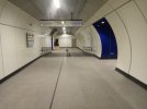
Decided to test the new bits. It is huge improvement on the old claustrophobic setup of the Northern Line through Bank station.
So here is the new circulation space in place of the old southbound platform:

P1190354 by Geogregor*, on Flickr
Wide connections with the northbound platform:

P1190356 by Geogregor*, on Flickr

P1190409 by Geogregor*, on Flickr

P1190412 by Geogregor*, on Flickr

P1190425 by Geogregor*, on Flickr

P1190433 by Geogregor*, on Flickr
Old narrow passages:

P1190416 by Geogregor*, on Flickr

P1190408 by Geogregor*, on Flickr

P1190403 by Geogregor*, on Flickr
Link to the new southbound platform:

P1190423 by Geogregor*, on Flickr

P1190431 by Geogregor*, on Flickr
And here it is, wide, bright and spacious:

P1190361 by Geogregor*, on Flickr

P1190363 by Geogregor*, on Flickr

P1190365 by Geogregor*, on Flickr

P1190370 by Geogregor*, on Flickr

P1190374 by Geogregor*, on Flickr

P1190378 by Geogregor*, on Flickr

P1190380 by Geogregor*, on Flickr

P1190388 by Geogregor*, on Flickr

P1190392 by Geogregor*, on Flickr

P1190395 by Geogregor*, on Flickr

P1190398 by Geogregor*, on Flickr

P1190401 by Geogregor*, on Flickr

P1190375 by Geogregor*, on Flickr
Now we have to wait for the new connection to Central line (with travelators) and new Cannon Street entrance.
So here is the new circulation space in place of the old southbound platform:
P1190354 by Geogregor*, on Flickr
Wide connections with the northbound platform:
P1190356 by Geogregor*, on Flickr
P1190409 by Geogregor*, on Flickr
P1190412 by Geogregor*, on Flickr
P1190425 by Geogregor*, on Flickr
P1190433 by Geogregor*, on Flickr
Old narrow passages:
P1190416 by Geogregor*, on Flickr
P1190408 by Geogregor*, on Flickr
P1190403 by Geogregor*, on Flickr
Link to the new southbound platform:
P1190423 by Geogregor*, on Flickr
P1190431 by Geogregor*, on Flickr
And here it is, wide, bright and spacious:
P1190361 by Geogregor*, on Flickr
P1190363 by Geogregor*, on Flickr
P1190365 by Geogregor*, on Flickr
P1190370 by Geogregor*, on Flickr
P1190374 by Geogregor*, on Flickr
P1190378 by Geogregor*, on Flickr
P1190380 by Geogregor*, on Flickr
P1190388 by Geogregor*, on Flickr
P1190392 by Geogregor*, on Flickr
P1190395 by Geogregor*, on Flickr
P1190398 by Geogregor*, on Flickr
P1190401 by Geogregor*, on Flickr
P1190375 by Geogregor*, on Flickr
Now we have to wait for the new connection to Central line (with travelators) and new Cannon Street entrance.
Bravo for taking some proper photos! Even the video coverage on YouTube wasn't able to convey the look and feel as you have!Decided to test the new bits. It is huge improvement on the old claustrophobic setup of the Northern Line through Bank station.
So here is the new circulation space in place of the old southbound platform:
Mikey C
Established Member
- Joined
- 11 Feb 2013
- Messages
- 6,888
It's different in the suburbs though, as there the majority of people will be waiting on one platform, thus that one is the one where people are likely to linger.In general, I can think of no good reason why a pair of platforms should match. In particular, at Bethnal Green the London bound platform was always saturated with advertising, while the Essex-bound platform had a very naked feel by comparison.
At Bank I imagine that it's roughly 50/50 whether people are travelling north or south.
I hope these aren't as much of a choke point as the ones at London Bridge Northern line platforms are, which are such a bad choke point that they made the whole refurb when they added the JLE utterly pointless...
I hope these aren't as much of a choke point as the ones at London Bridge Northern line platforms are, which are such a bad choke point that they made the whole refurb when they added the JLE utterly pointless...
There are several much wider ones at both ends of the platform
swt_passenger
Veteran Member
- Joined
- 7 Apr 2010
- Messages
- 31,531
I suspect all the wider “adits” (that was a term used in a video!) line up with the new main cross passages and people will tend to use them by default, and especially if they follow the signage. That’s certainly as it’s drawn in the layout in post #165.There are several much wider ones at both ends of the platform
Which should leave the narrow existing ones as something of a bonus.
I made a rather devious journey back to Waterloo from Cutty Sark DLR today to see the new bits. Wow, the photos on here are good but when you see it in person that new cavern between north and south lines is HUGE! Very impressive. I was going to make a day of it and head down to Battersea Power Station but found I would have to wait 10 minutes at Kennington. No doubt when all the flats get occupants the frequency on the new bit will increase. Anyway, another day for that.
- Status
- Not open for further replies.